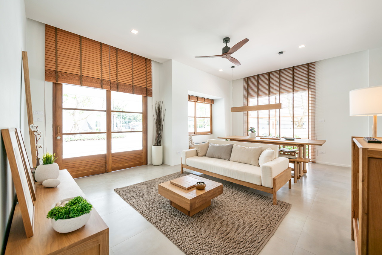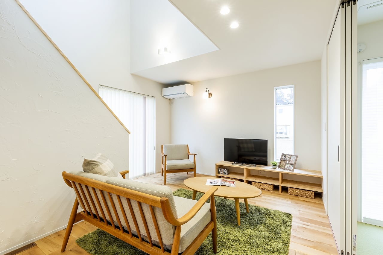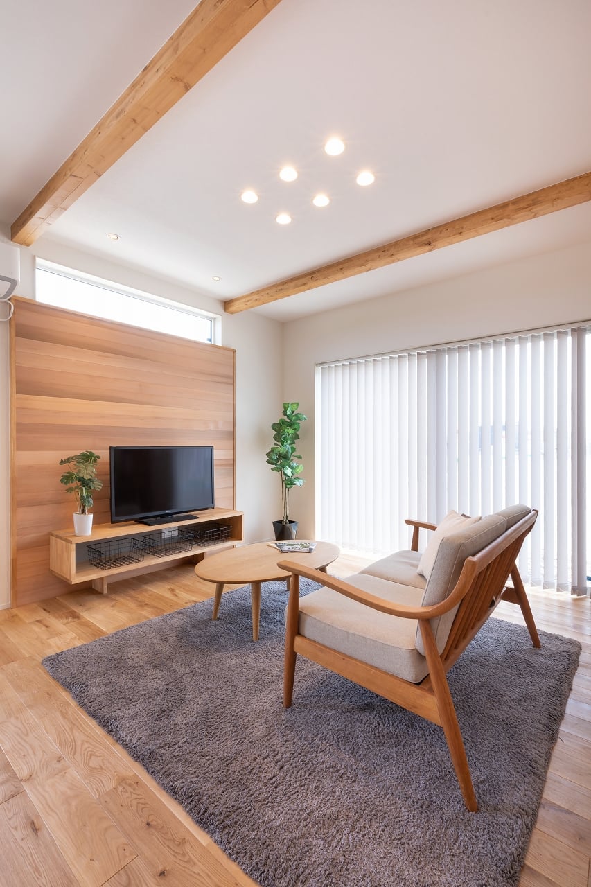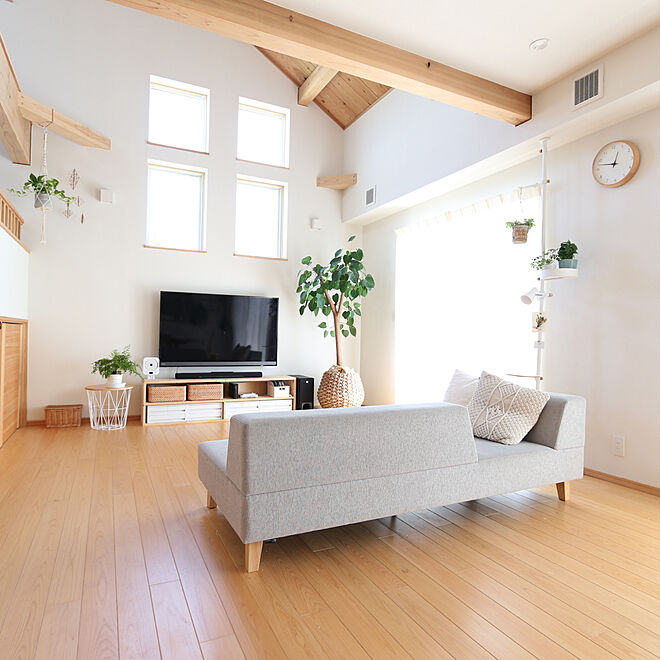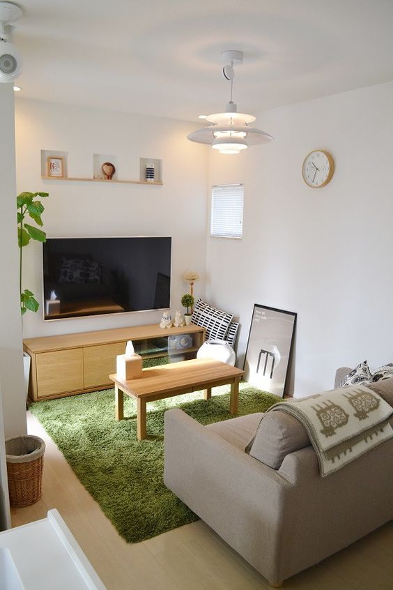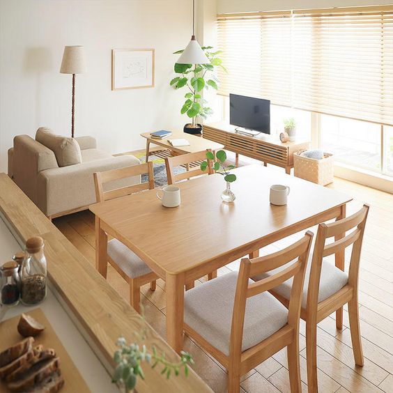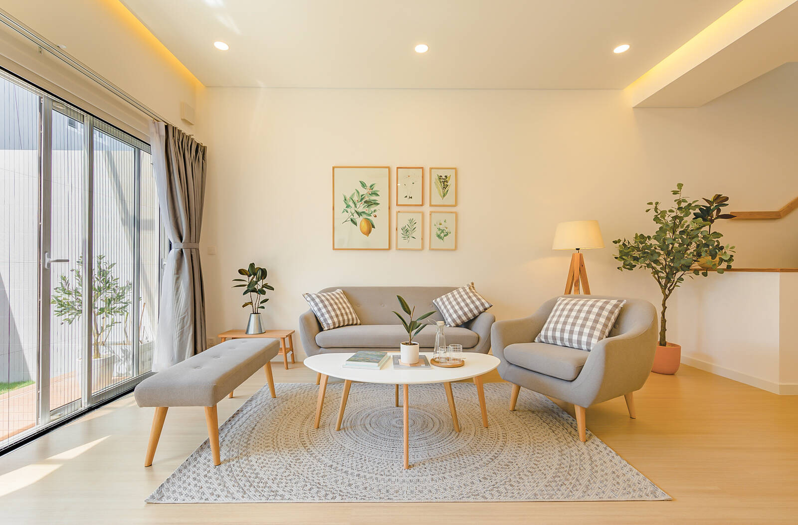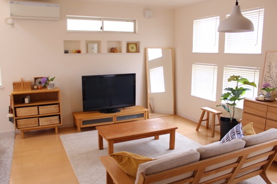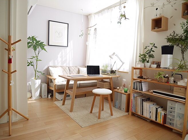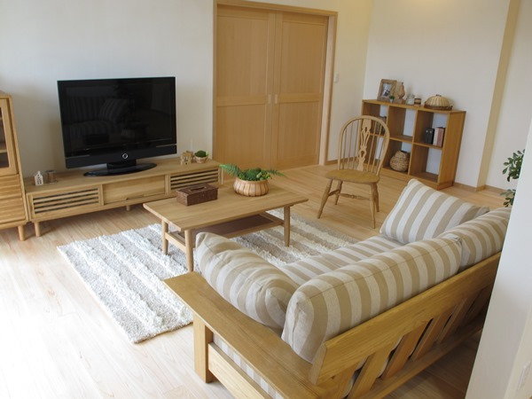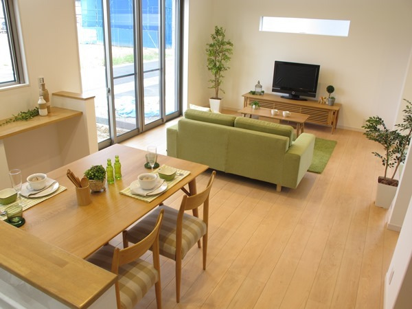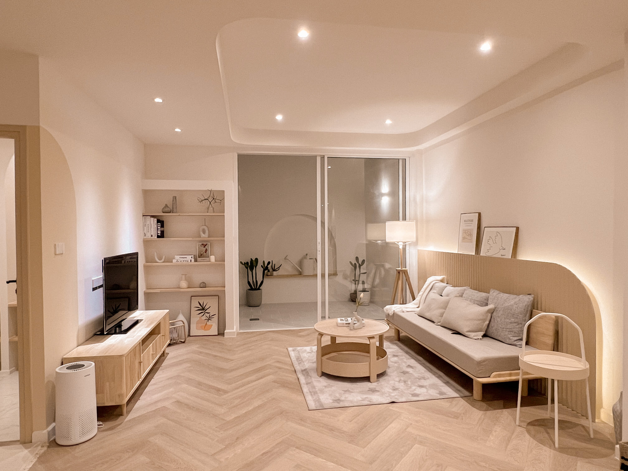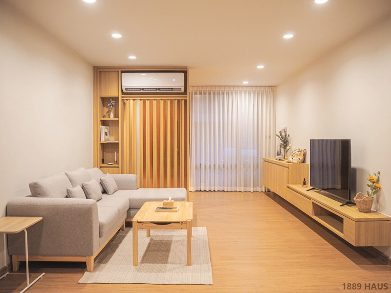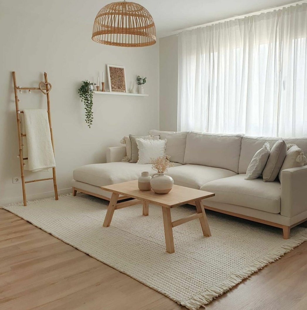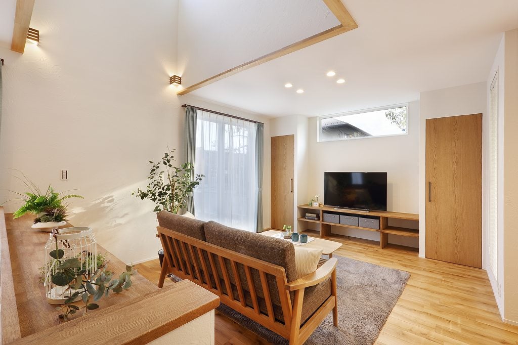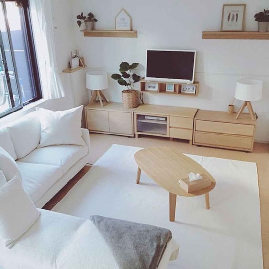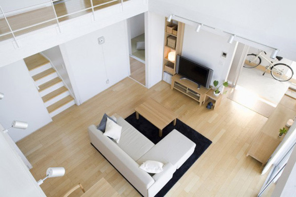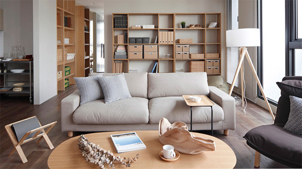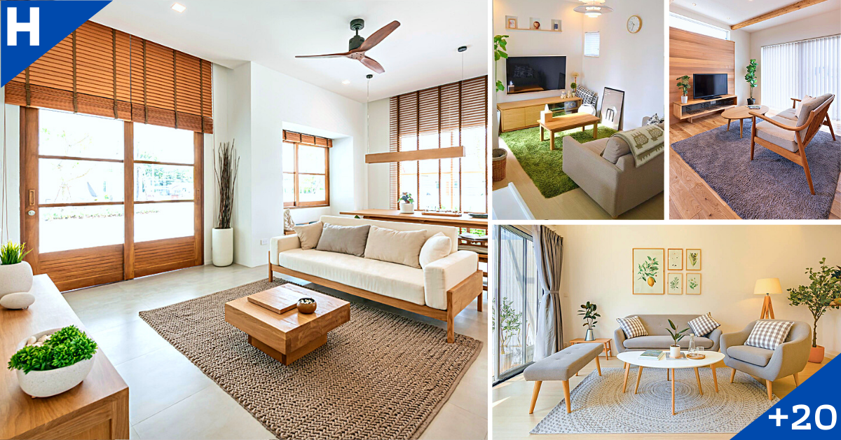
Muji (Mujirushi Ryōhin) 無印良品 aka No Brand Quality Goods, is certainly no stranger to us; it is an international Japanese retail company which sells a wide variety of household and consumer goods that oozes the understated Japanese aesthetic.
Muji’s successful brand hinges on the ability to deliver simple, functional and quality home products to the consumers. In addition, its immerse popularity has earned Muji quite a number of loyal followers!
Therefore, it is not surprising that a lot of homeowners are also mimicking Muji’s signature look that is synonymous with functional and pared-down design.
Certainly, emulating such a minimalist, the design process involves finding the perfect equilibrium of practicality and style; certainly a fine art of subtle balancing act between aesthetics, functionality and even sustainability.
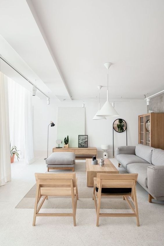
Minimalist spaces are instantly recognisable for their crisp, clean, clutter-free and monochromatic look. The de-cluttering of space helps to de-clutter the mind and to create a sense of visual calm. However, some minimalist designs do run the risk of feeling a little soulless.
Minimalist furniture and accessories focus on functionality and practicality. Flat, smooth surfaces and strong, clean lines create bold statements that emphasise the essential nature of each item.
You won’t find highly patterned furnishings and accessories or highly detailed ornamentation. Instead, the focus is on the purity and simplicity of the shape and form.
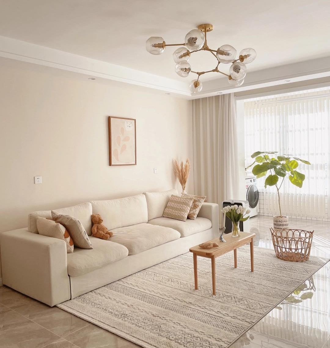
Textiles add texture and provide added dimension and warmth to a space. Drapery, bedding, cushions, and area rugs in varying textiles such as linen, wool, and cotton are just a few examples of how you can add warmth and comfort to a room while maintaining a minimalist style.
When using a monochromatic colour palette, a great way to bring warmth to the space is by incorporating different shades and mixing textures. For instance, the use of linen wallpaper and soft wool fabrics and rugs in the bedroom adds soothing warmth.
In the bathroom, the texture and grain of tile patterns can add visual interest while still maintaining a neutral colour palette, while wood accessories can soften stark, white or concrete elements.
.
.
.
.
.
.
.
.
.
.
Credit: Pinterest

