Architects : WARchitect
Area : 150 m²
Year : 2019
Photographs : Rungkit Charoenwat
City : Khet Chatuchak, Thailand
.
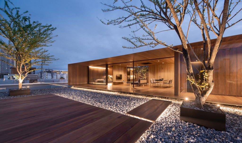
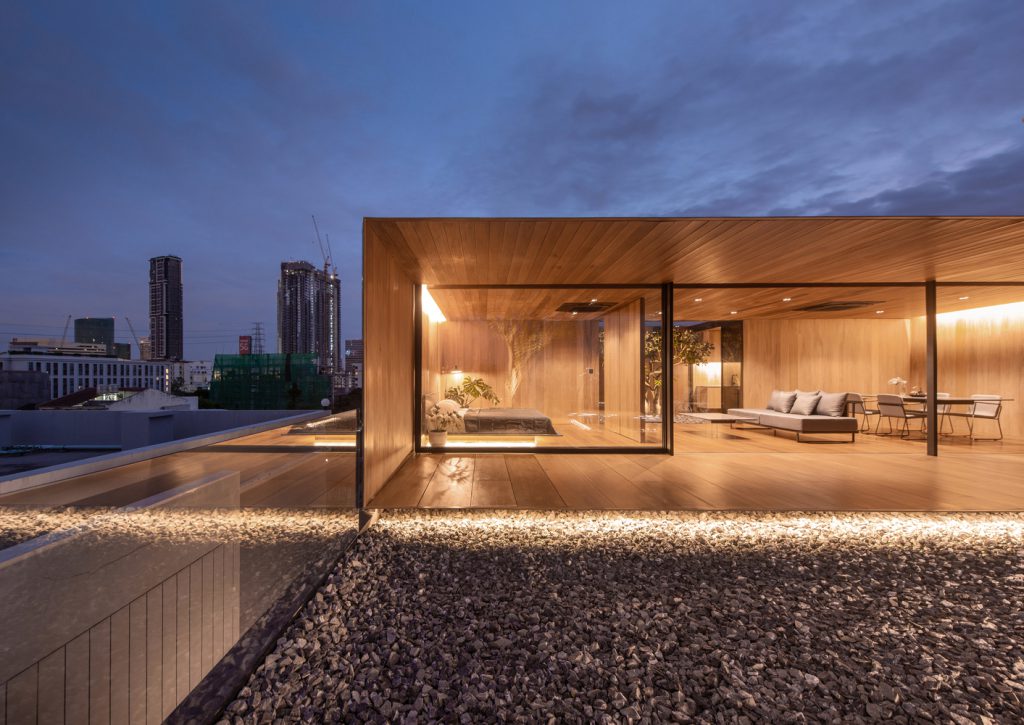
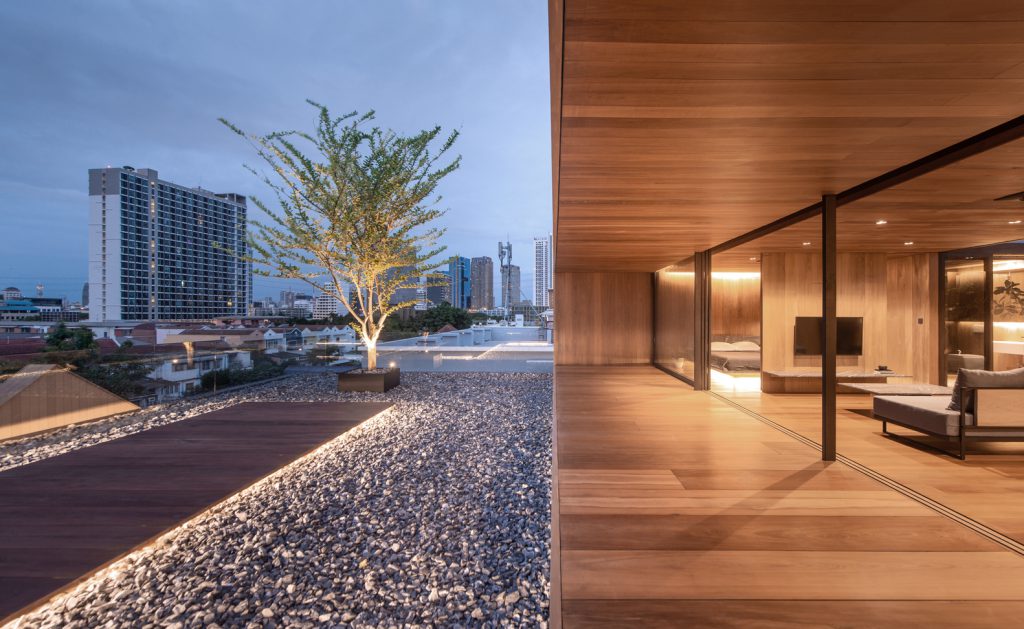
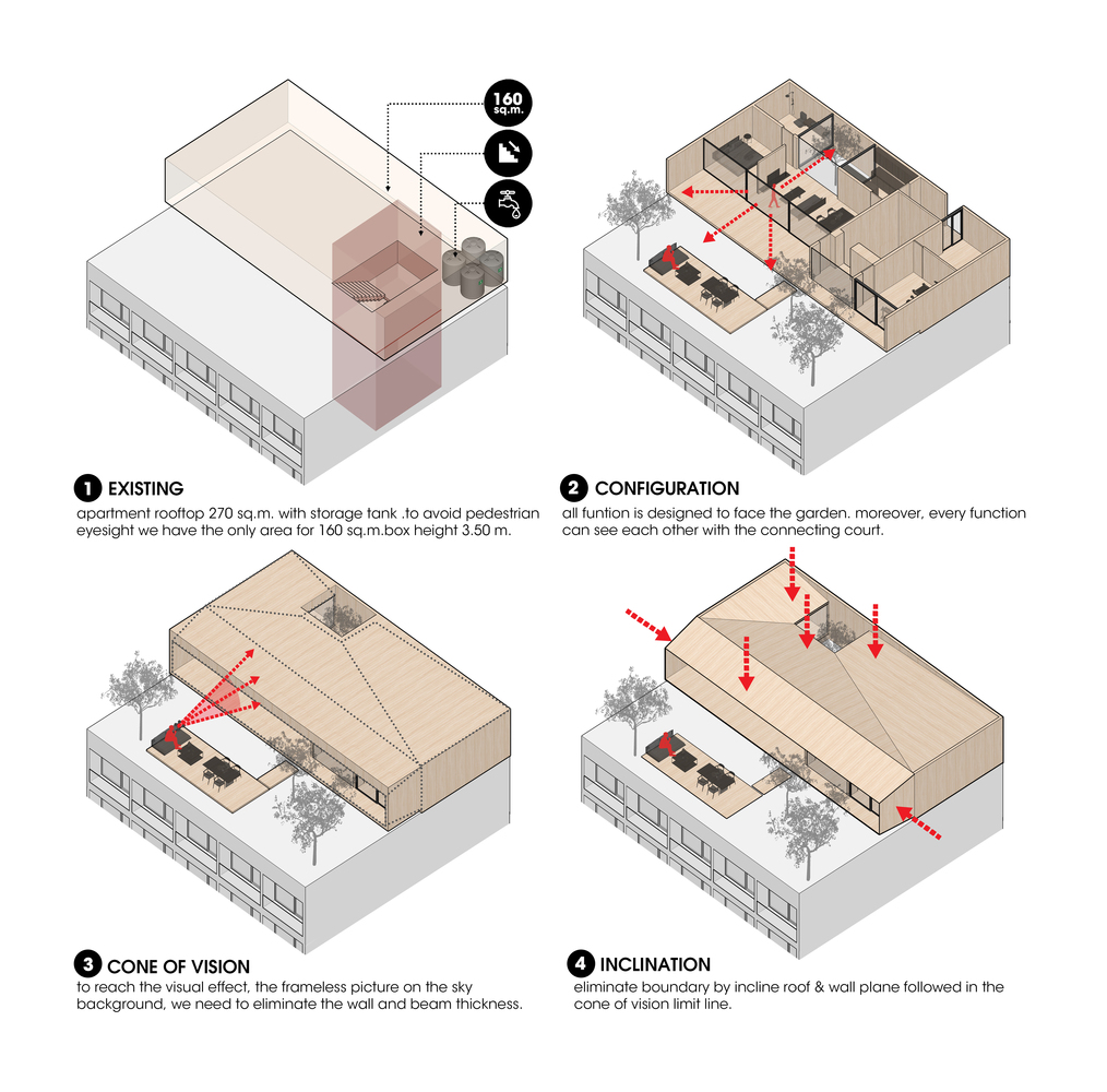
The project’s owner runs a 5-story apartment. In the past, the rooftop was only used to keep water tanks, leaving a lot of empty space. The owner, therefore, wished to build a small house there for his own use. The rooftop location is an interestingly unique context that sets this project apart from other housing designs.
.
.
.
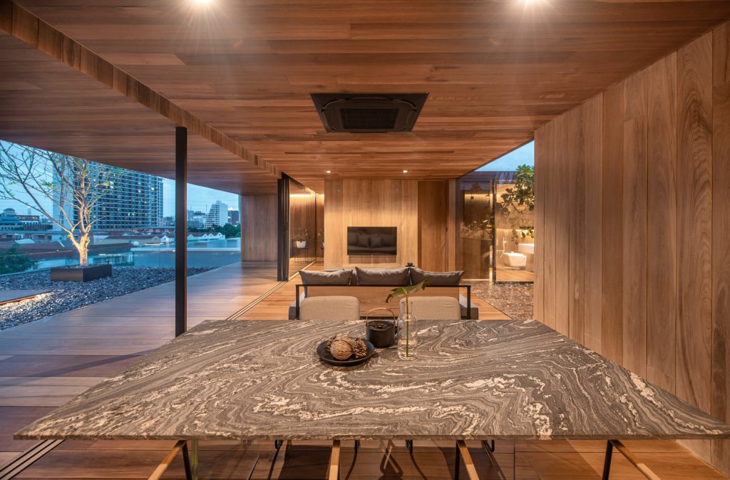
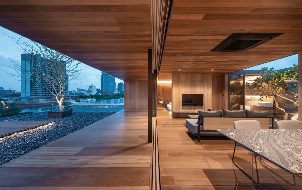
Instead of a normal ground, this house has a concrete courtyard. Trees are replaced with vertical lines of tall buildings in the Lat Phrao district. The 0.00 ground level is elevated to the level of over 15.00 meters. In addition, this house would have only the front façade and could not be seen from the side and the back. To avoid creating a stark contrast between this house and the apartment below, our team designed this house so that no one could see it from public roads.
.
.
.
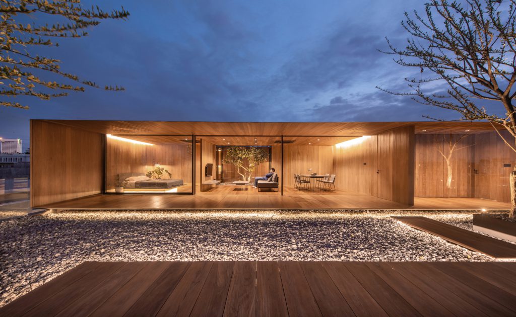
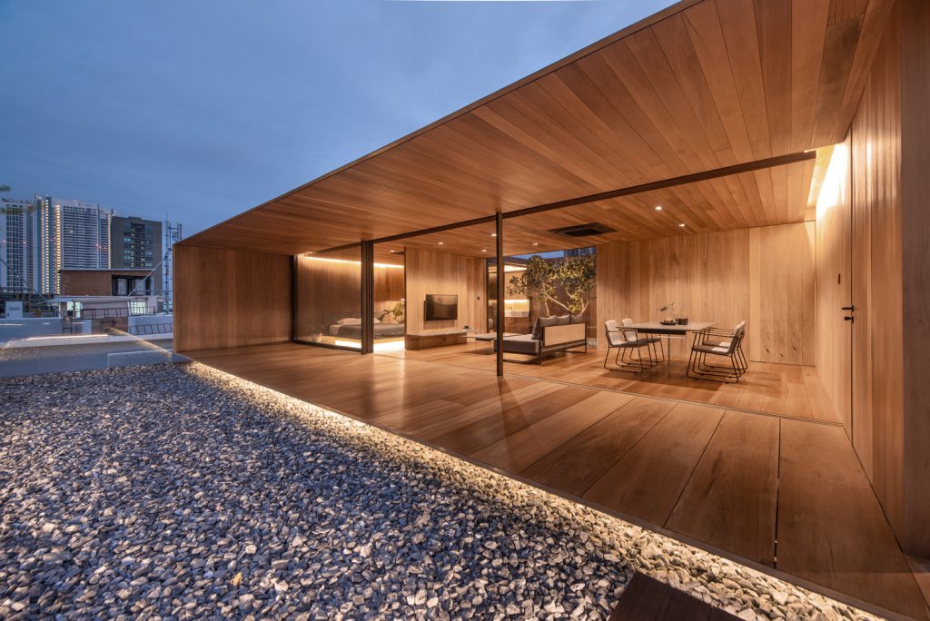
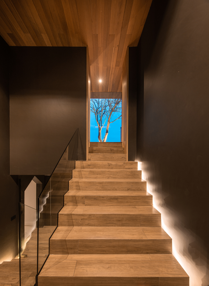
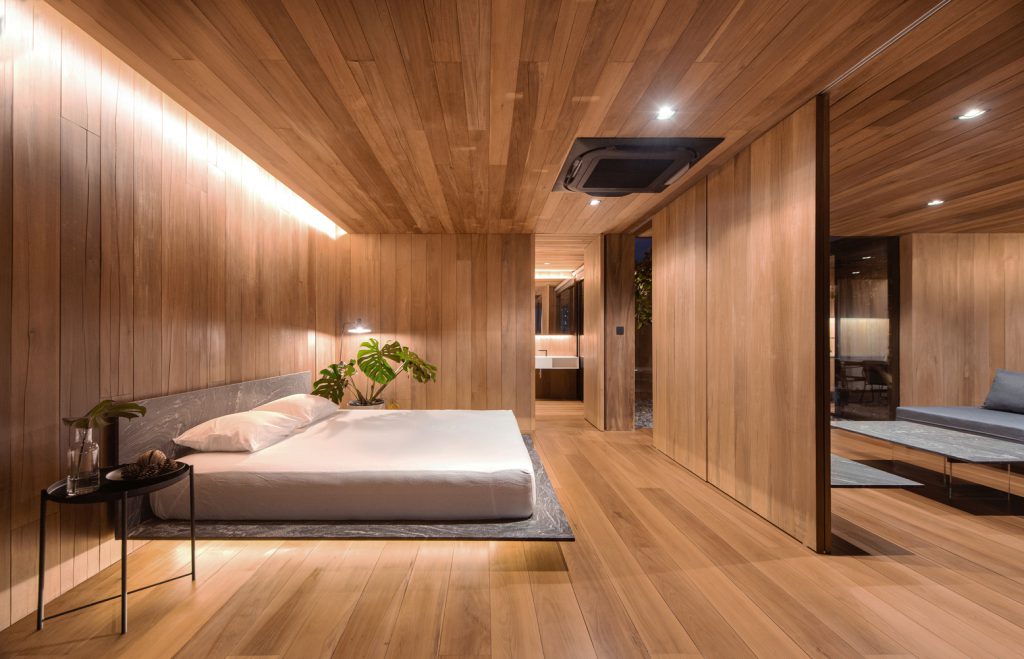
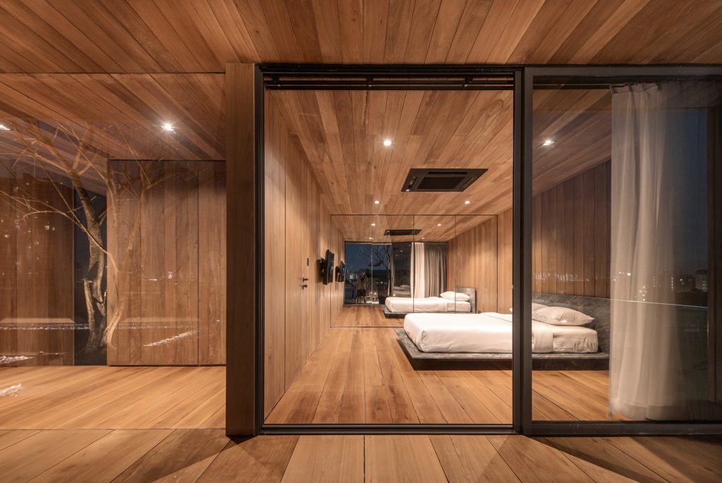
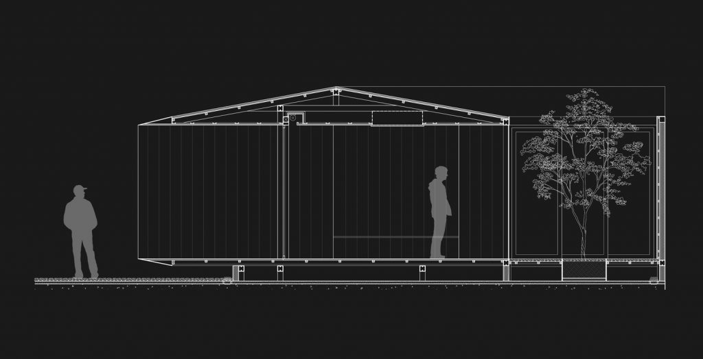
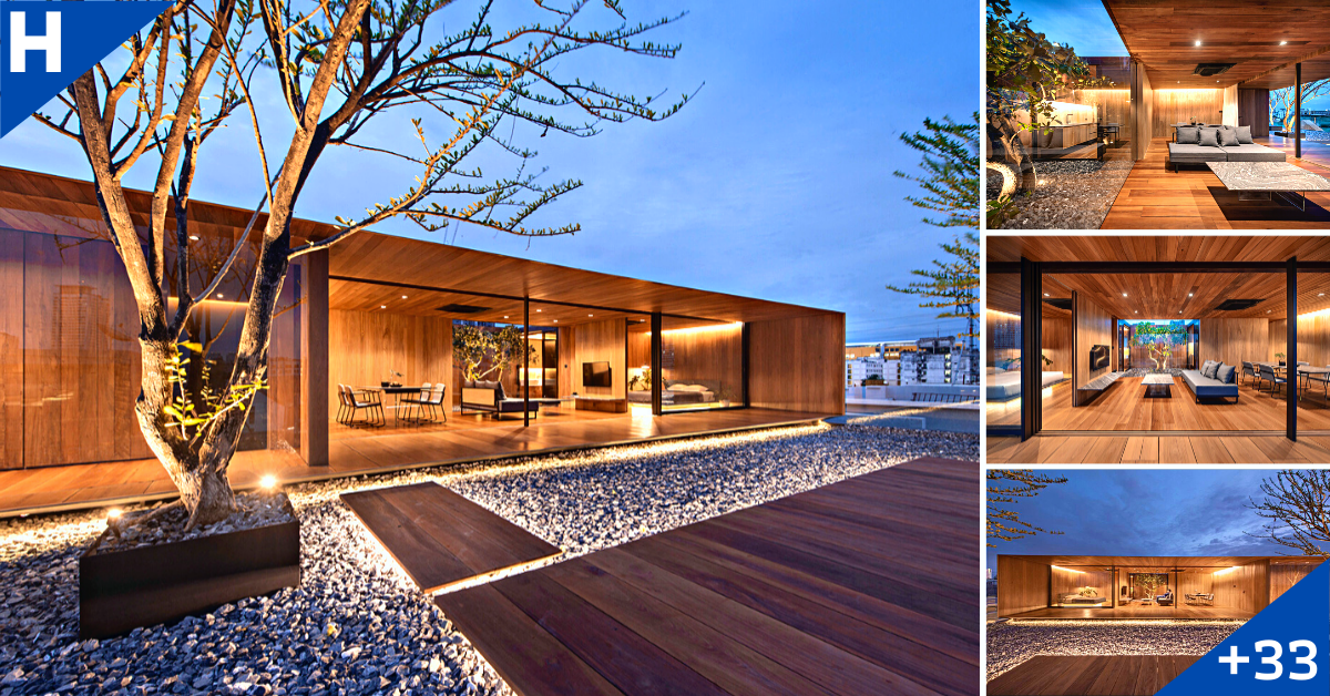
Our idea was not to make this house feel like a building, but to free it from form. We wanted it to be just a borderless box that emerges out of nowhere in the sky, as if the thickness of the wall and roof were non-existent, but still able to make holes in the ceiling to install curtains, air conditioners, and embed lights.
.
.
.
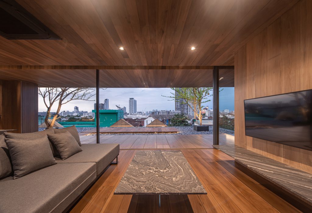
Our intention was to give an illusion to onlookers that the entire ceiling was in the same straight line even though we featured a drop ceiling and a slope that was intentionally used to make the wall and ceiling look thin. These techniques may not be new in architecture. However, with this rooftop house, it is more special since a short distance between the main structure and the exterior helps disguise the techniques we used.
.
.
.
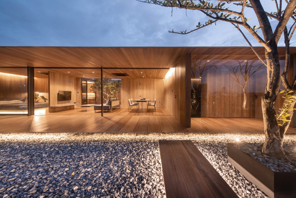
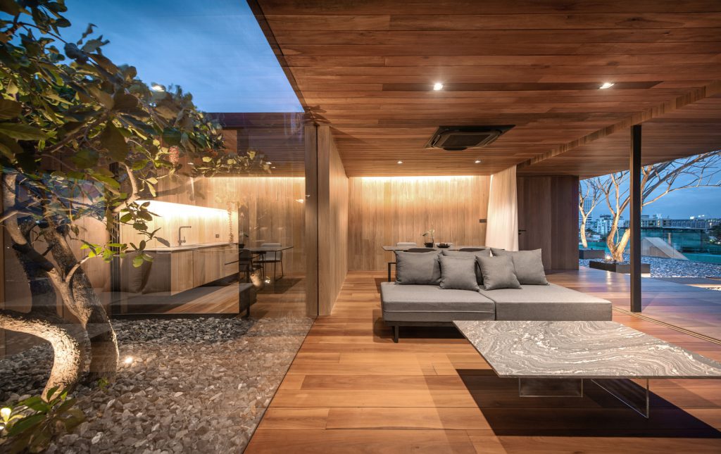
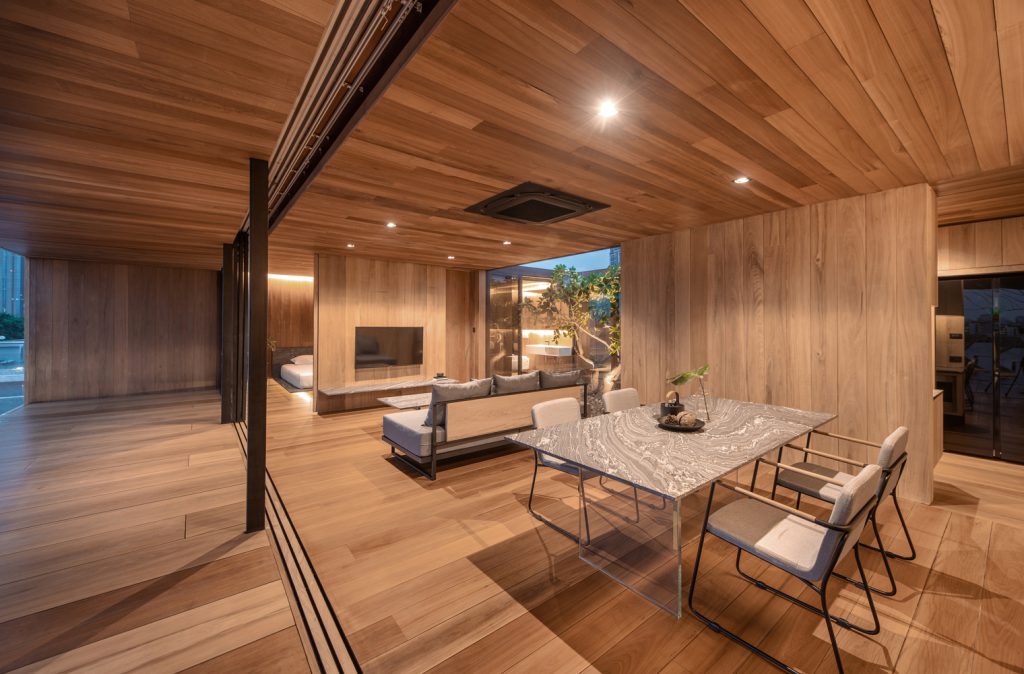
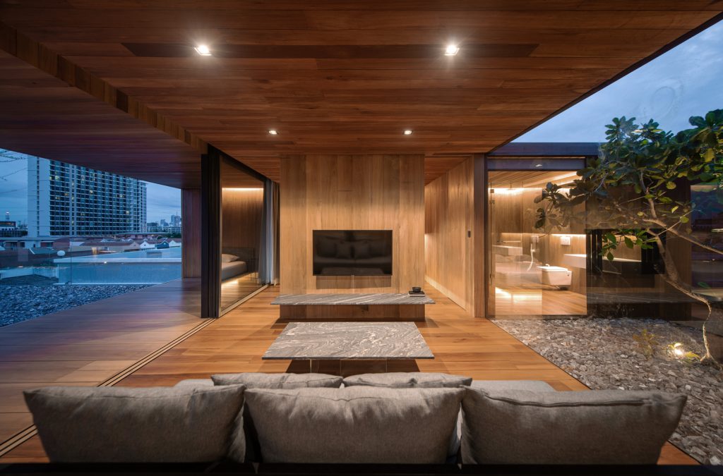
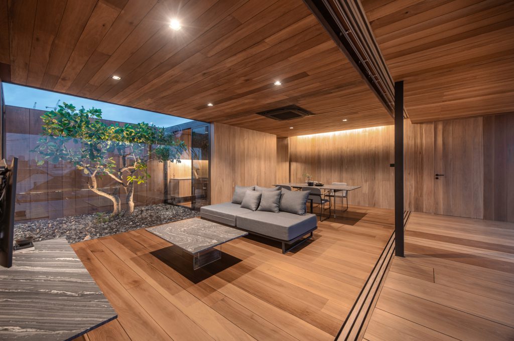
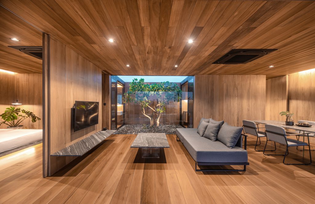
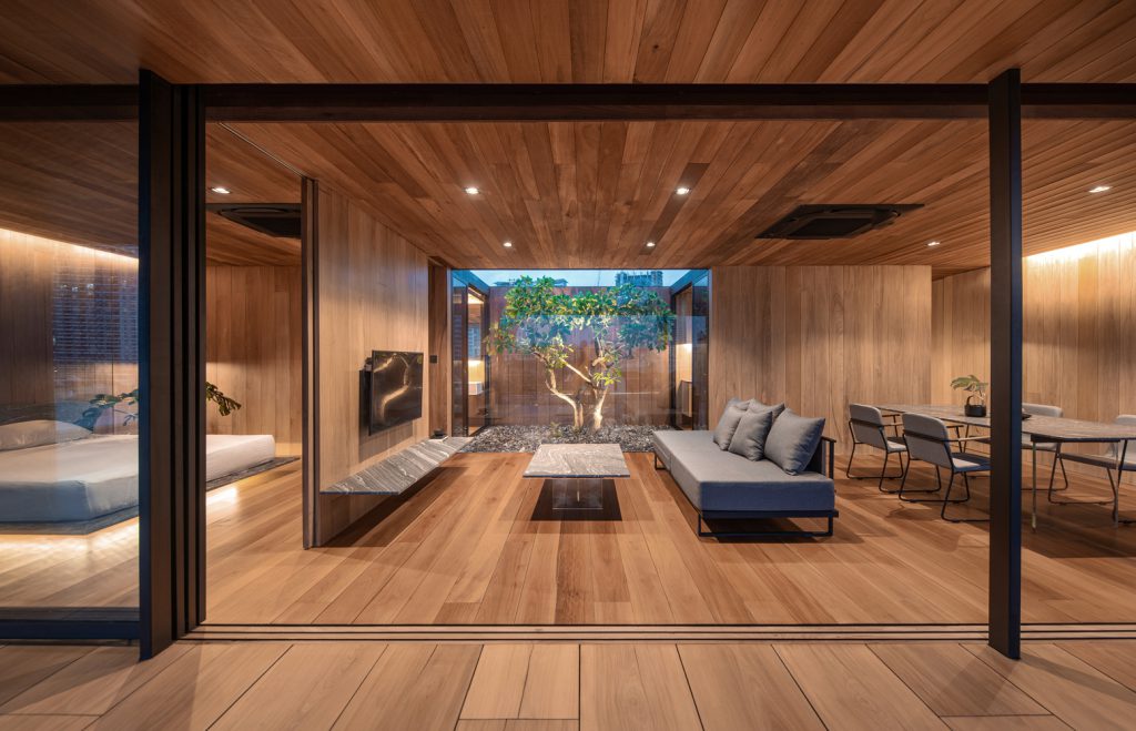
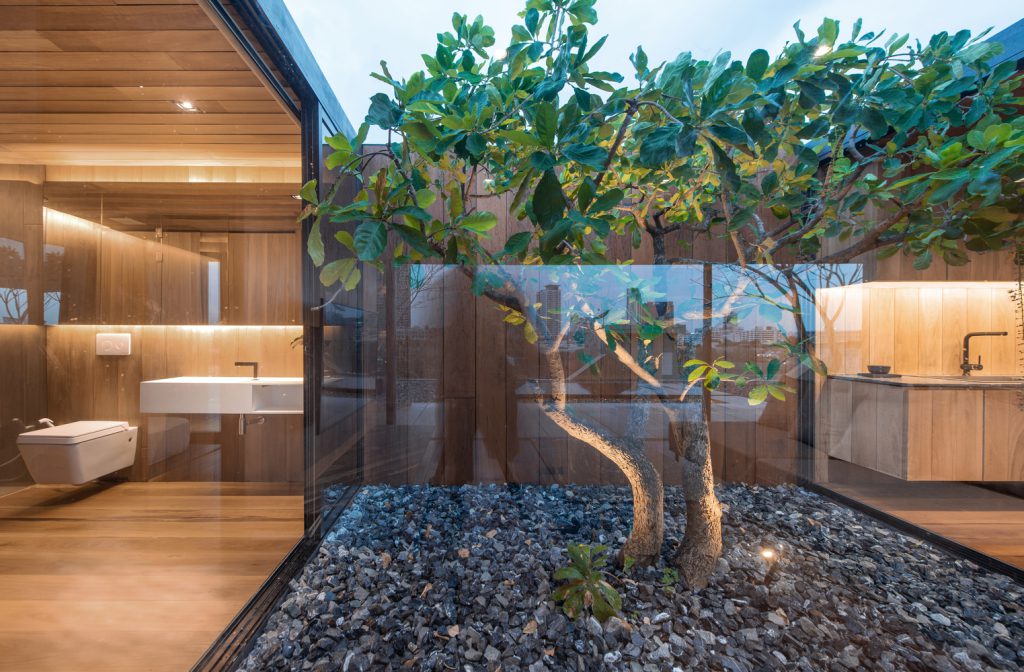
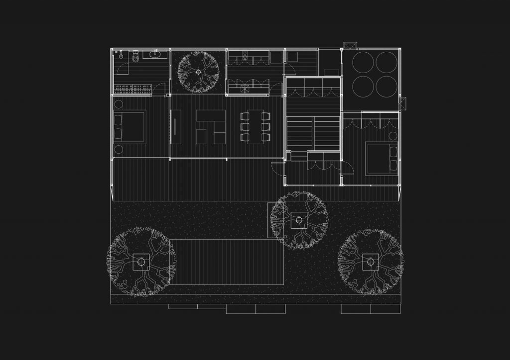
Concerning the function, the owner wanted the house to be simple for his private use as he did not frequently receive guests. Taking this into account, we thought that it would be interesting to make this house look more “naked” than usual. The boundary between each room is linked by a courtyard. The functional area is divided according to the grid of the apartment’s pillars underneath, resulting in a six-grid layout.
.
.
.
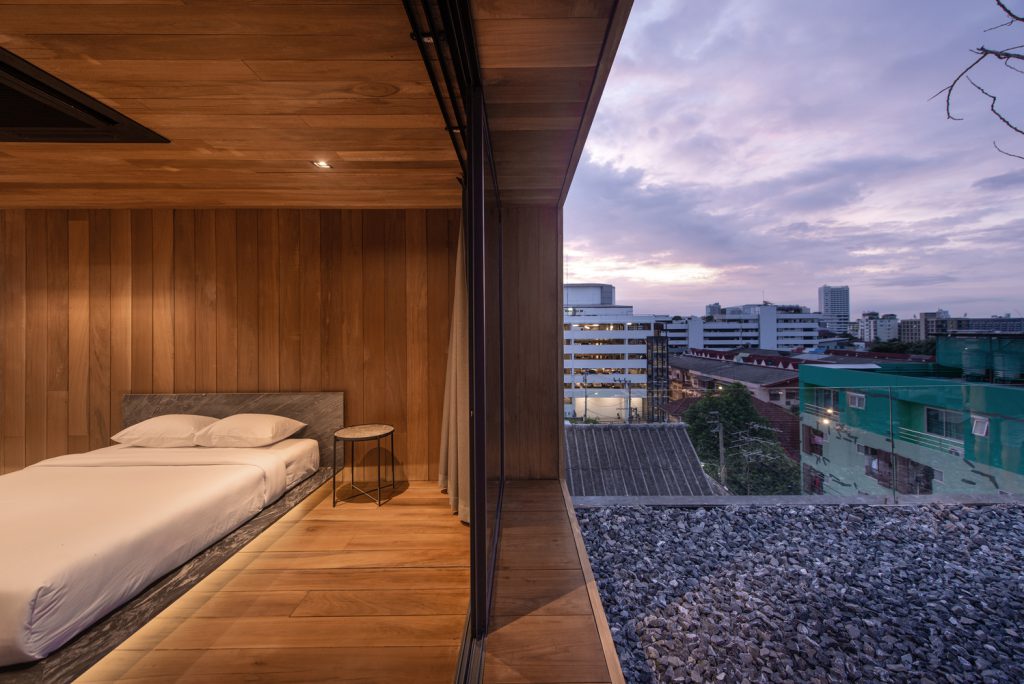
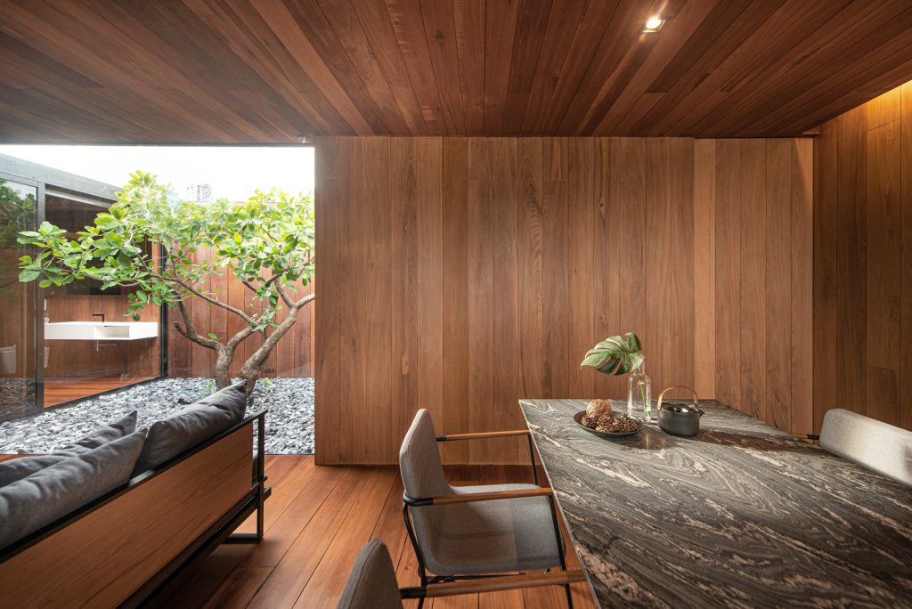
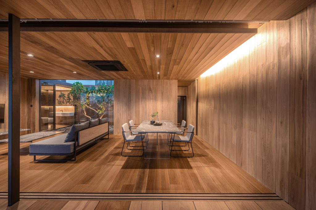
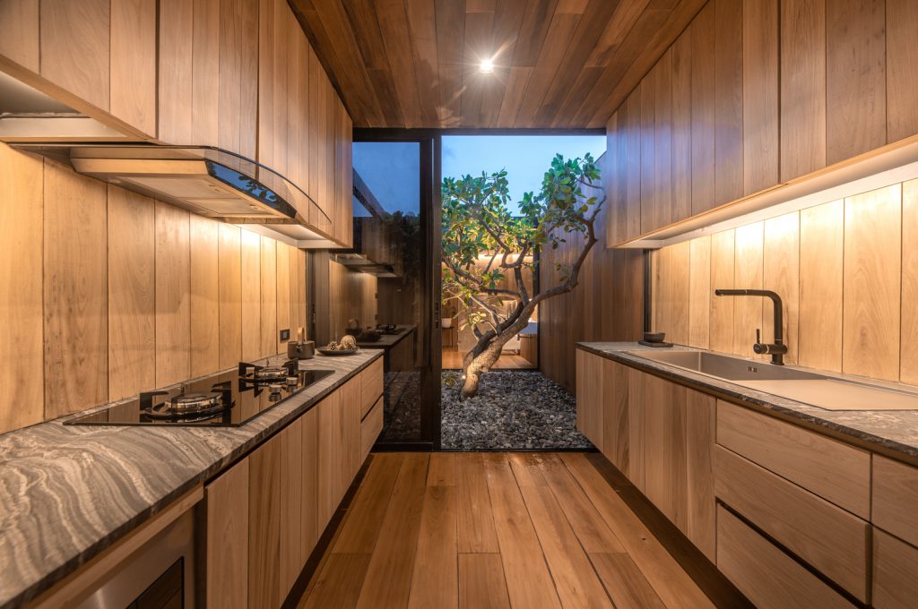
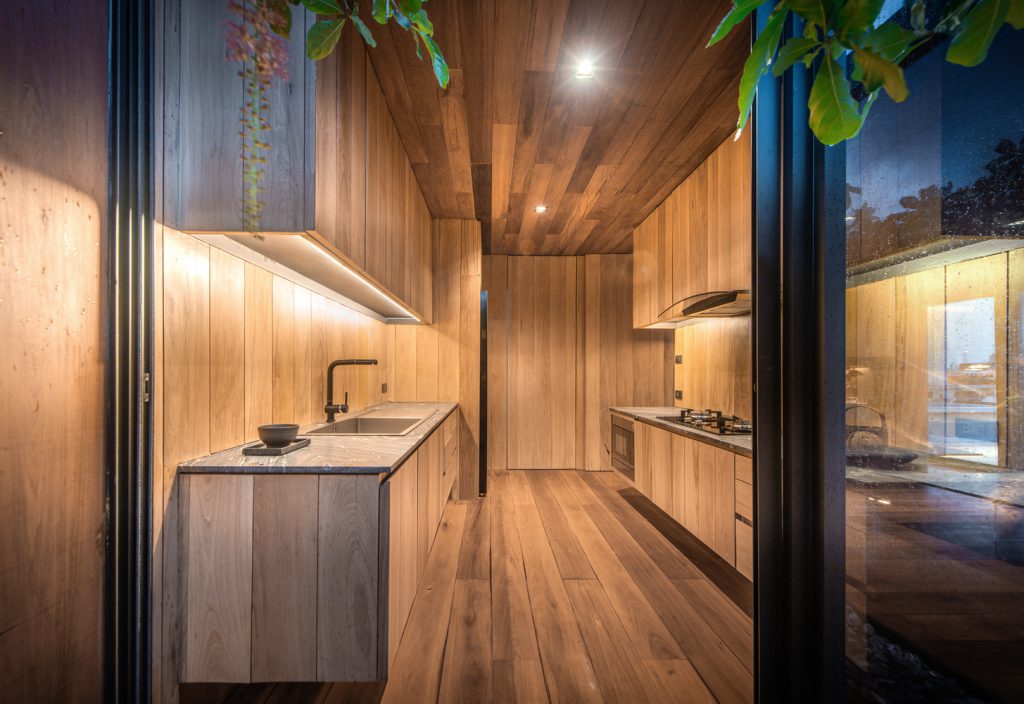
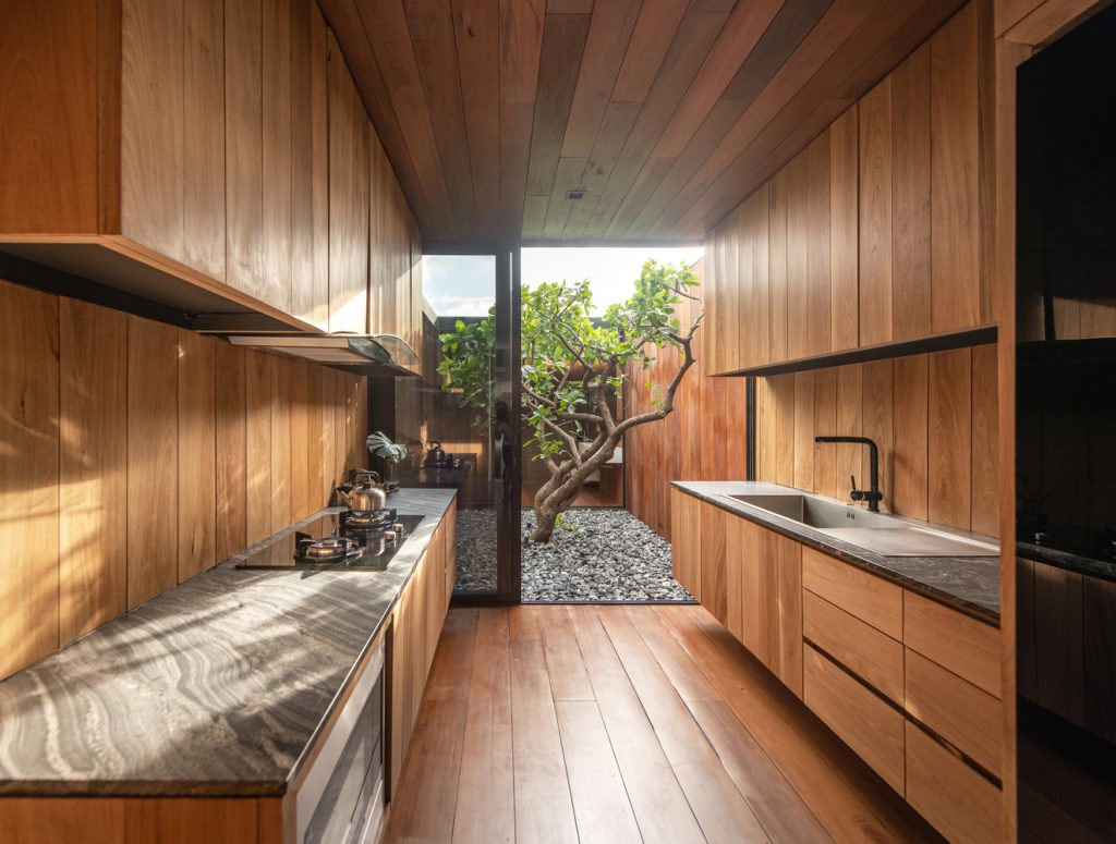
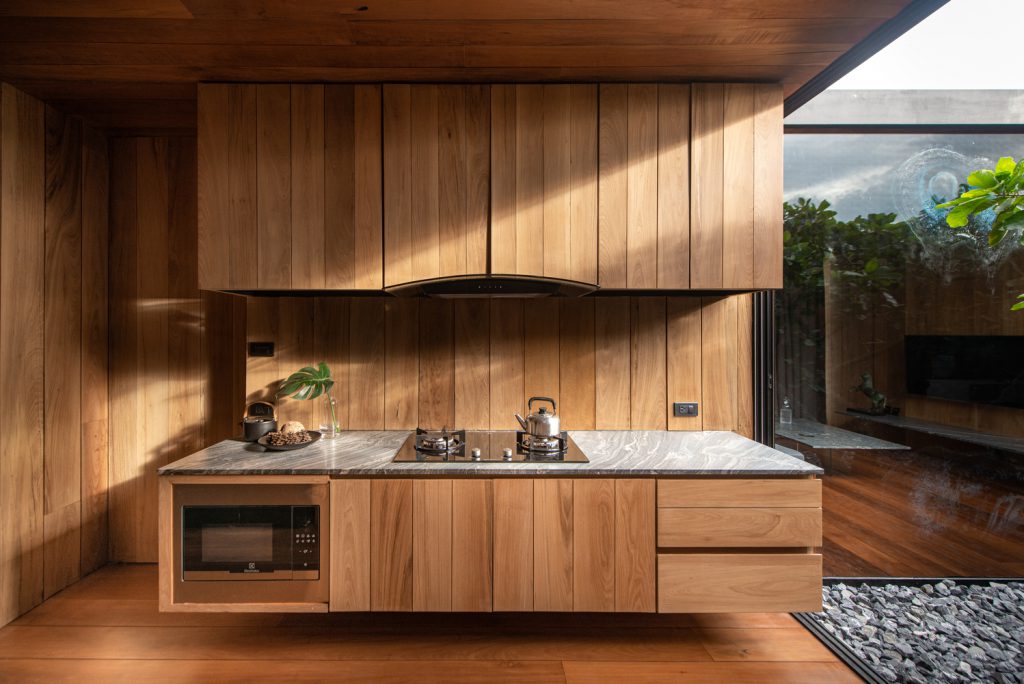
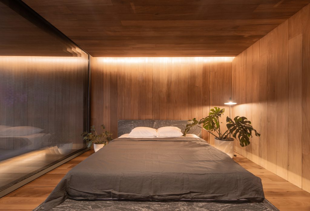
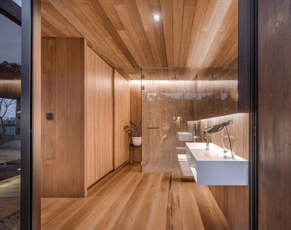
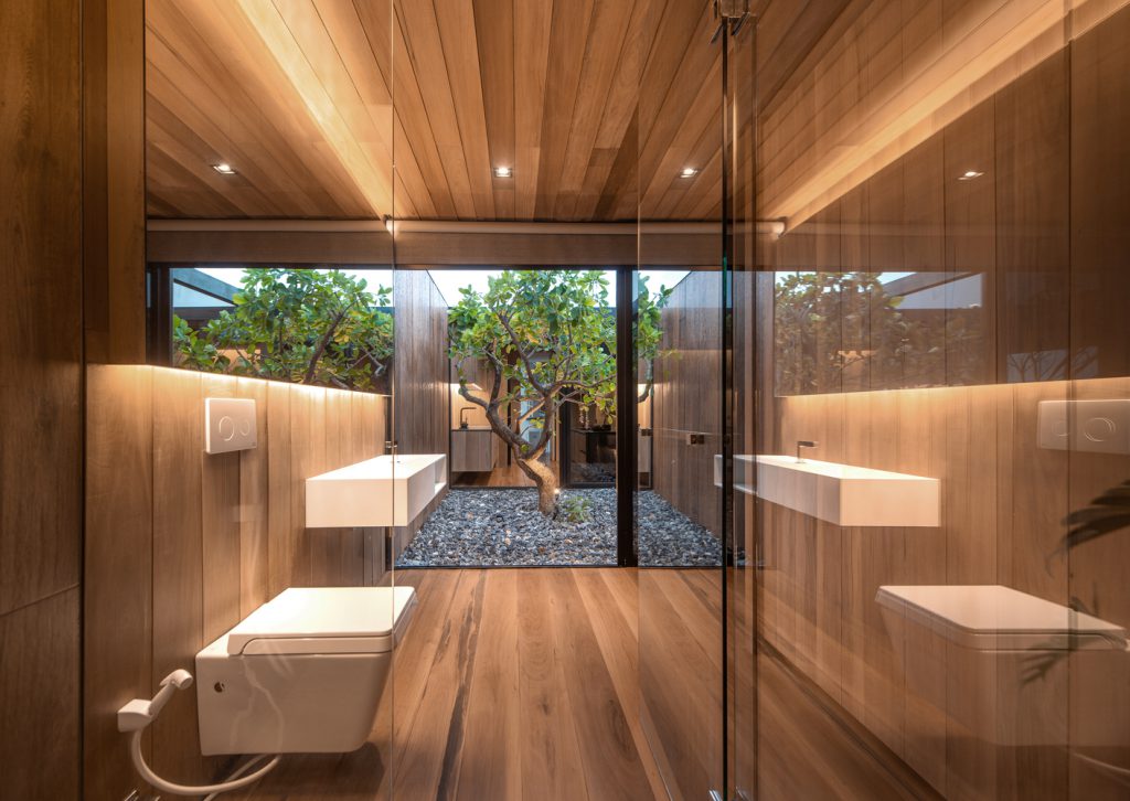
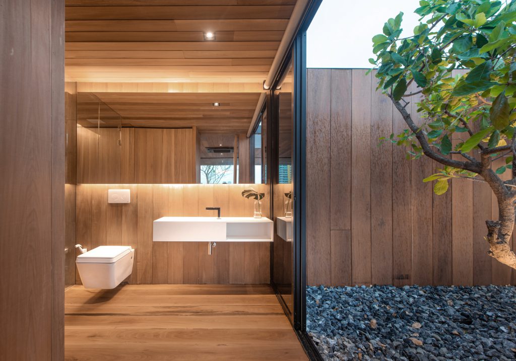
The front section consists of three grids which are used as 1. a dining area 2. a living room and 3. a bedroom where the owner can see a panoramic view through a large sliding glass door, which when slid close, the door frame will be precisely behind a small pillar, giving an impression that this building does not have a pillar. The back section consists of the remaining three grids which are used as 4. bathrooms 5. a courtyard that can be seen from anywhere in the house and 6. a kitchen.
.
.
.
Since the owner already had a large number of Balau wood planks, we used them as the covering material. Even some planks have defects such as cracks, gnarls, marks from saws, and uneven colors, we see them as a natural charm of real wood, so we did not need to discard any of them. When the construction was finished, the final result is a “space” completed with the warm color of wood and the cool tone of the sky, just exactly as we wanted it to be.
.
.
.
.
.
.
.
.
.
.
.
.
.
.
.
Cr. Archdaily

