Architects : BodinChapa Architects
Area : 220 m²
Year : 2020
Photographs : Witsawarut Kekina
Manufacturers : COTTO, Lamitak, Lamptitude, Ekoblok
City : Pak Phriao, Thailand
.
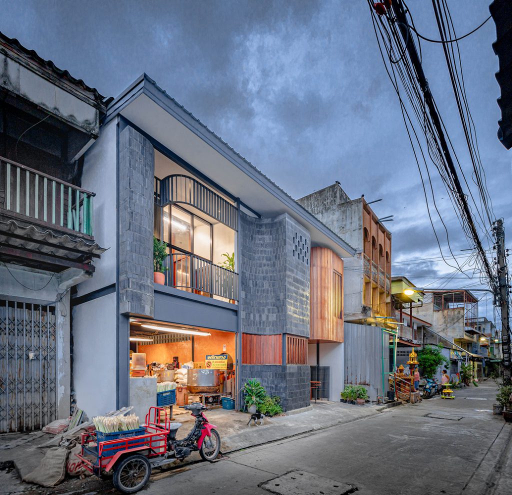
Baan priggang (Curry Paste Home) is surrounded by interesting household businesses, for instance, curry paste factory, and a local market. We will be able to experience the production of curry paste with clear shape, taste, smell, and sound.
.
.
The original area was a two and a half storey wooden house with a building on the side. The owner would like to renovate the old area which was the curry paste factory, a household business that has been used for many generations. The building conditions are deteriorated and ineffective in use to be the area that is both residential and able to support the business in the future effectively.
.
.
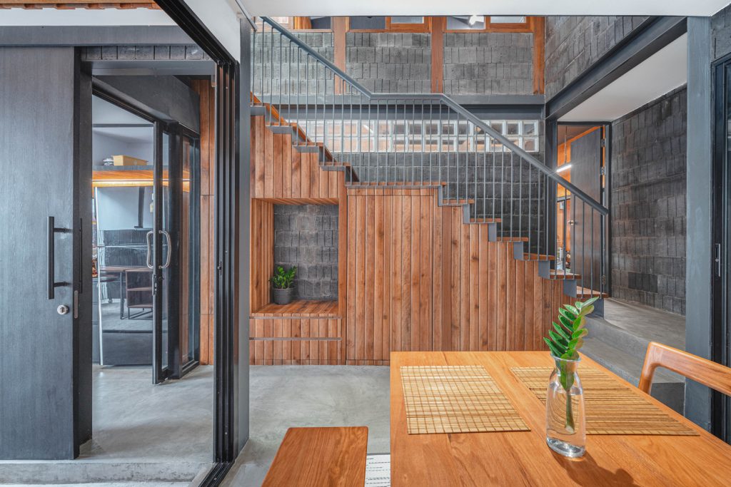
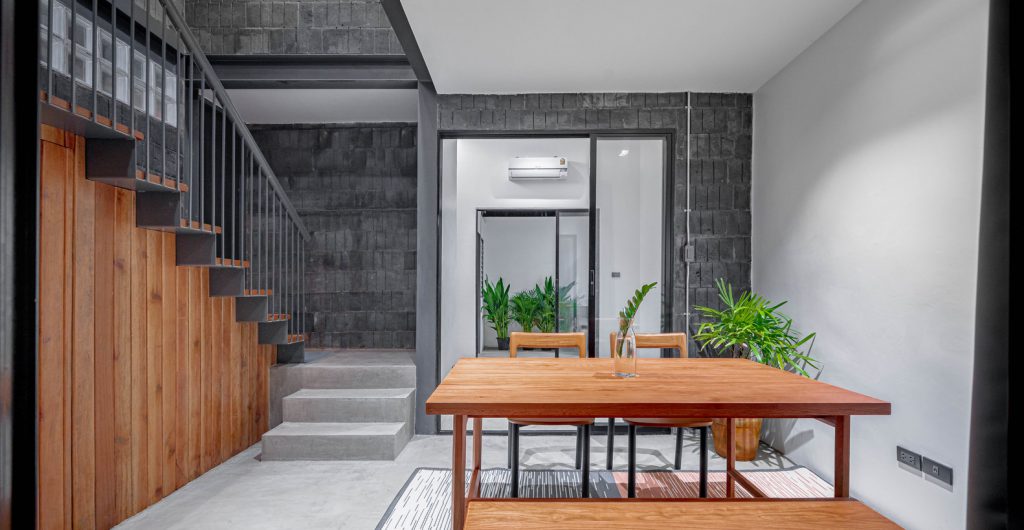
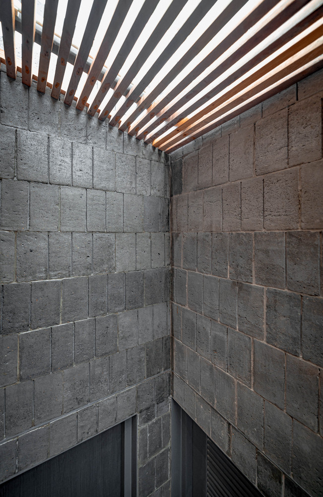
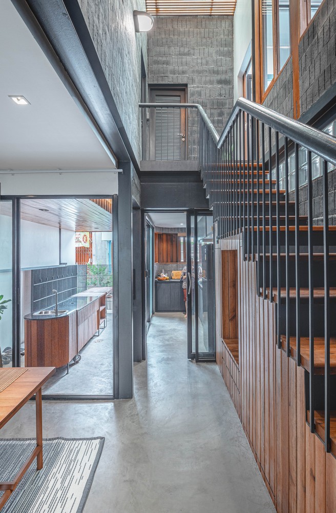
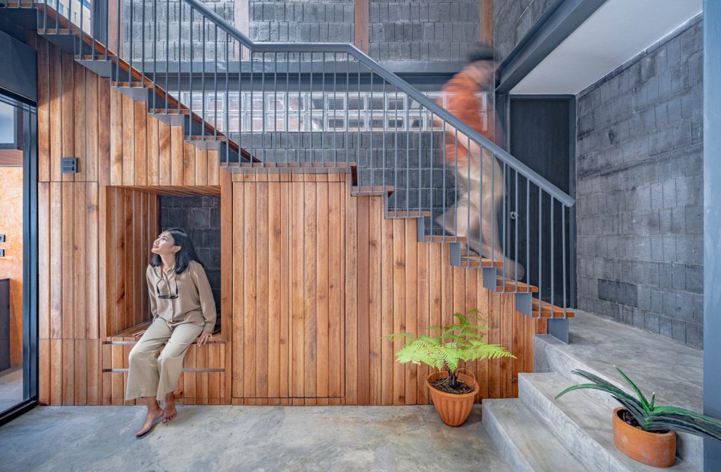
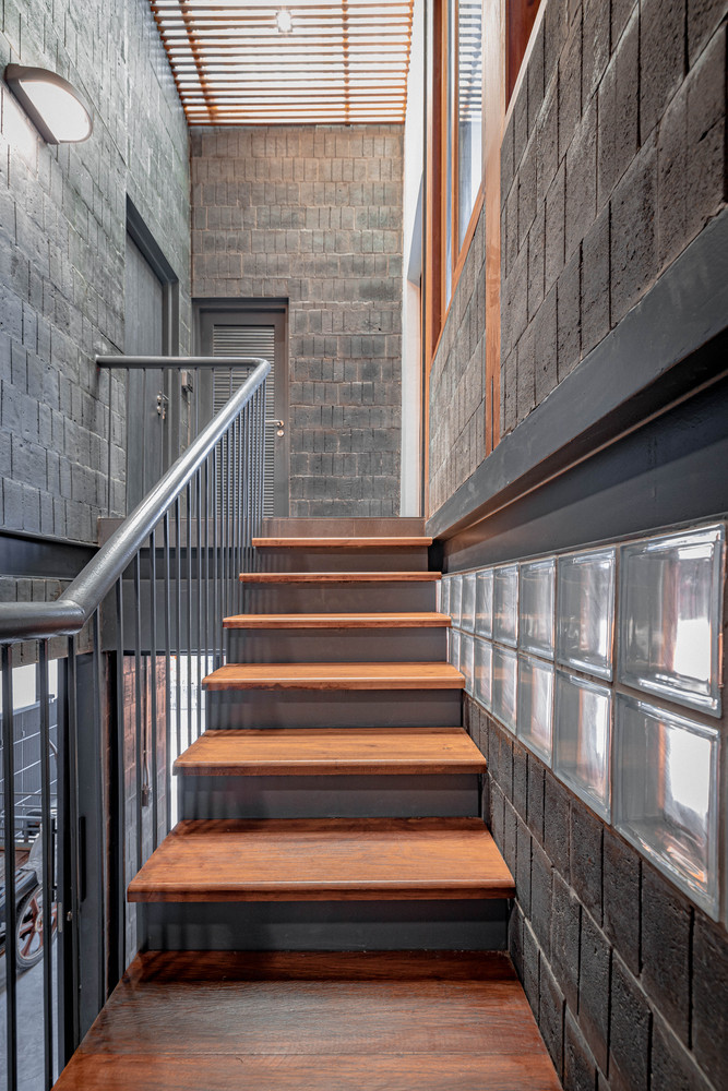
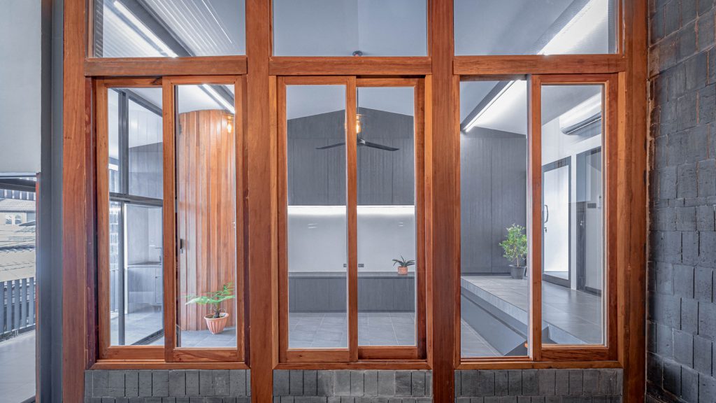
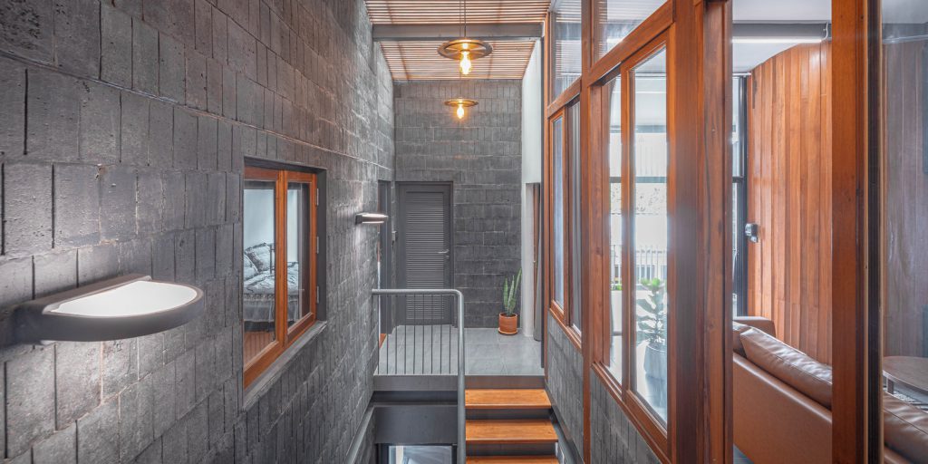
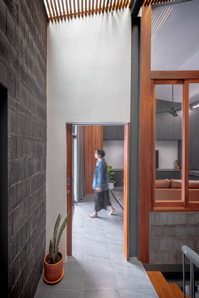
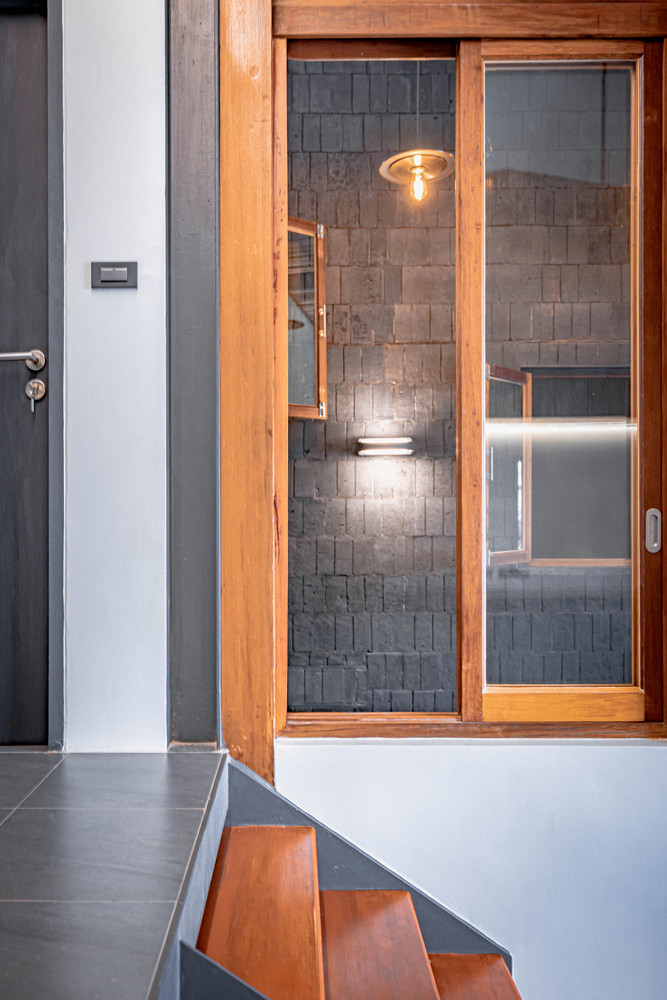
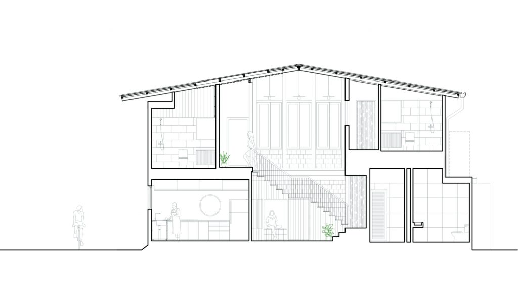
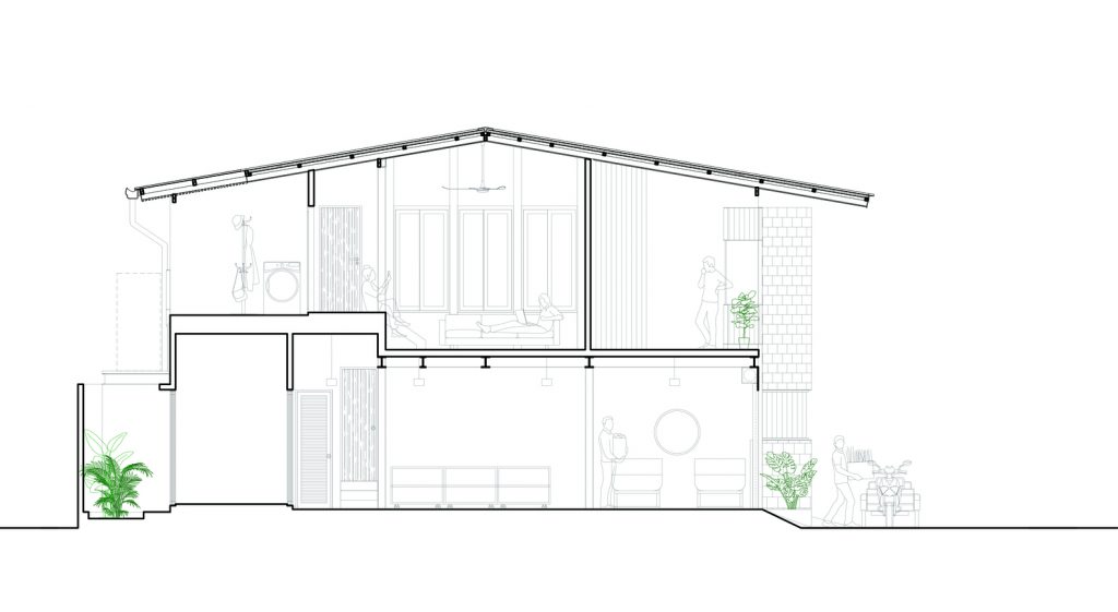
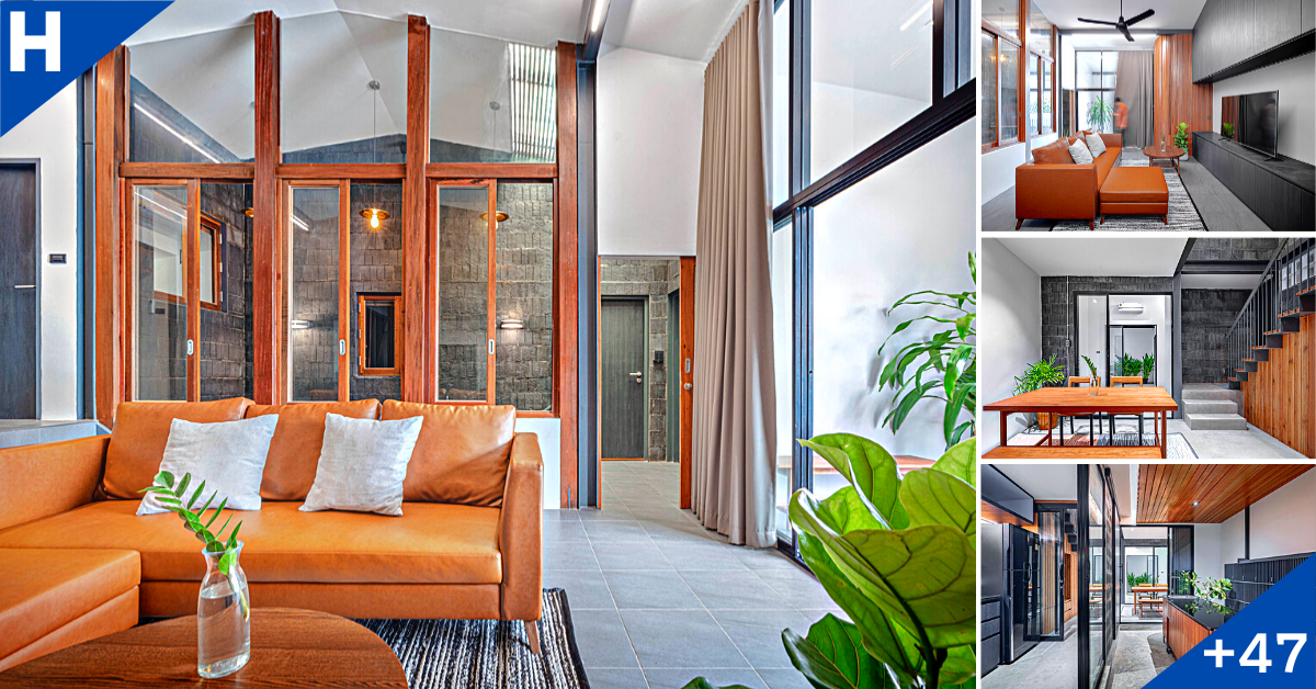
The area of the stairs was used to divide the building. It was designed as an open space up to the second floor and opened the roof to allow the natural light to descend into the center of the building. It makes the house get enough light and save energy. Below the stairs has been converted into a living and storage area. Above the staircase, there are windows for 2 bedrooms. Including the living room that connects the view of the home. Moreover, the natural light is distributed in the staircases in the middle of the house to cover the various area thoroughly.
.
.
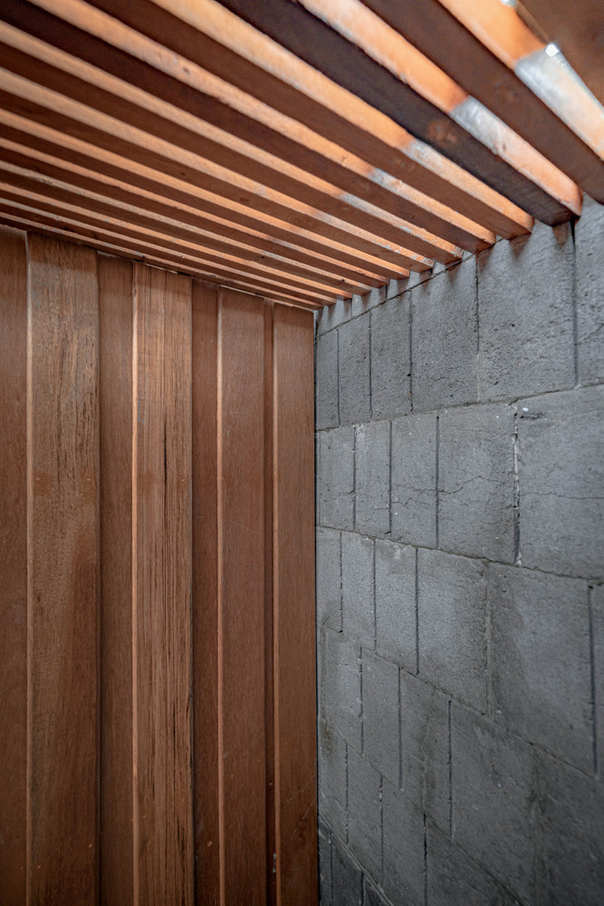
Due to the structure of the original building and some spaces have decayed by both termites and long use. Therefore, we decided to keep the old materials to be used in the construction of the new building as much as possible. The architect collects the details of the area and the old building, also planning the construction process as well.
.
.
During the construction, there must be an area to support the curry paste factory that cannot stop the production. Thus, the design is required by planning the construction for 2 phases, the inside area was separated into 2 parts as a solving of construction problems. which is a challenging constraint in both work and construction for the technician team.
.
.
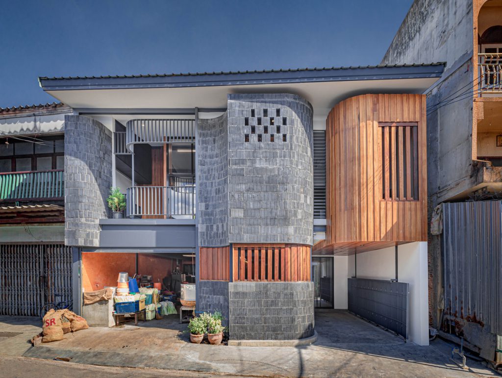
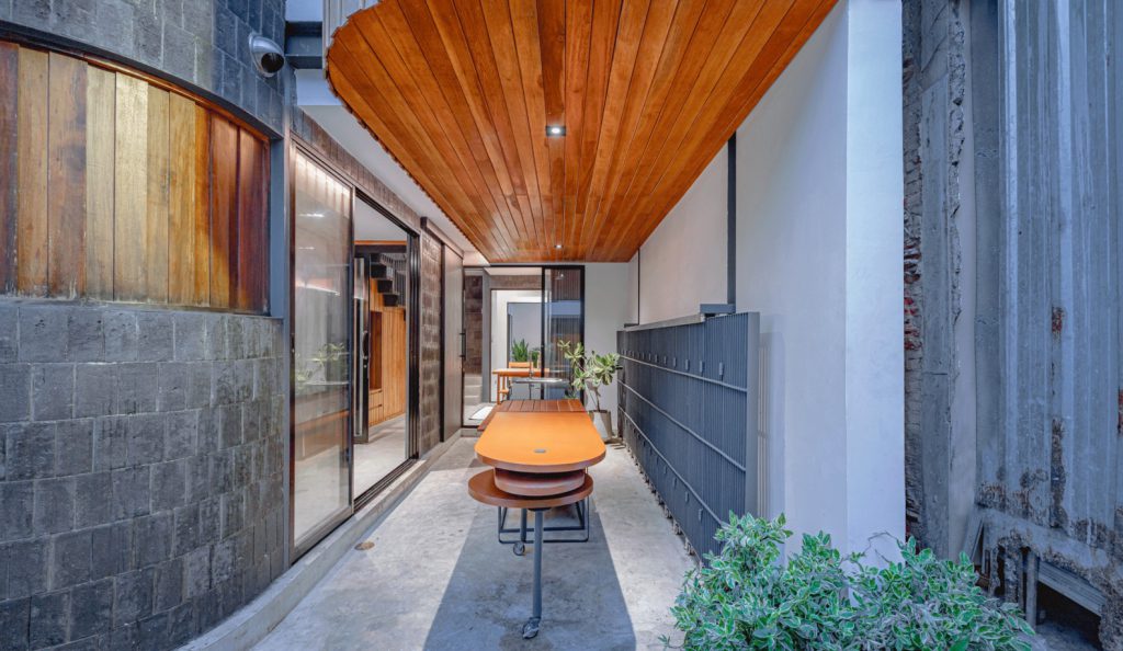
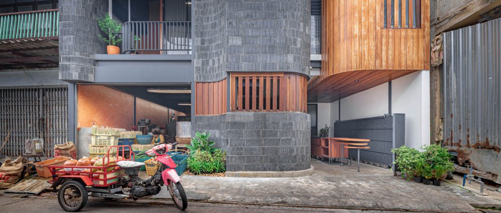
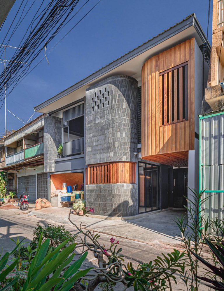
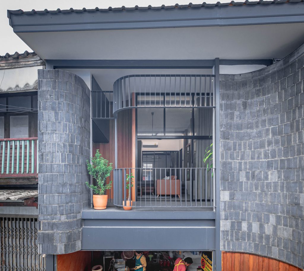
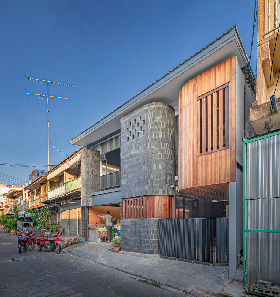
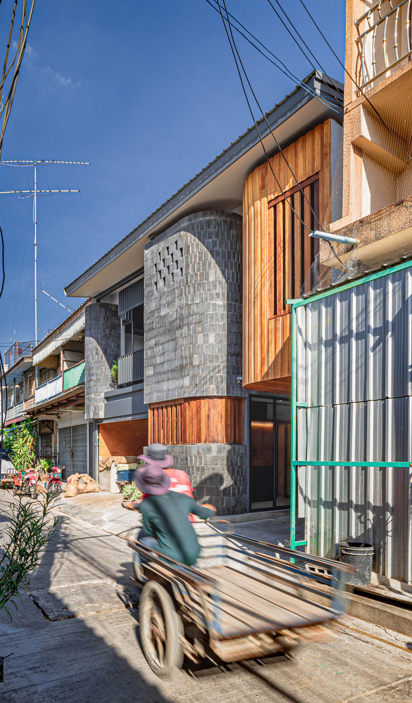
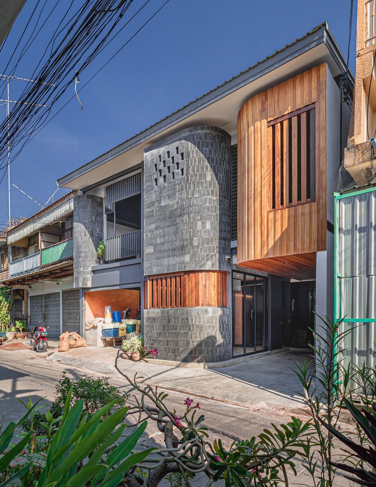
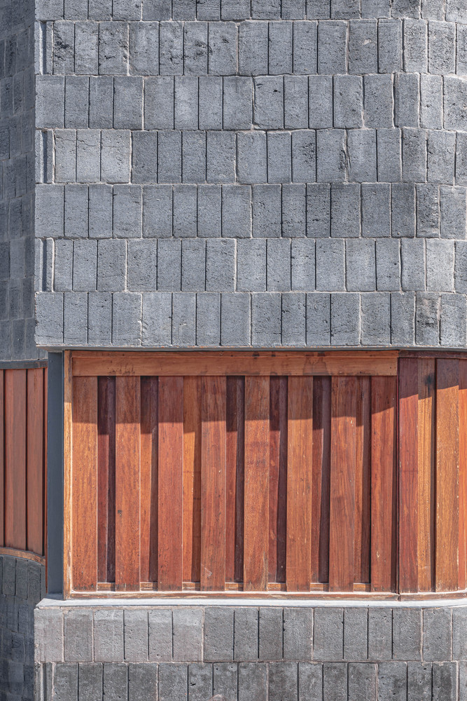
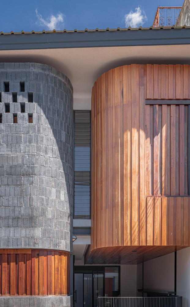
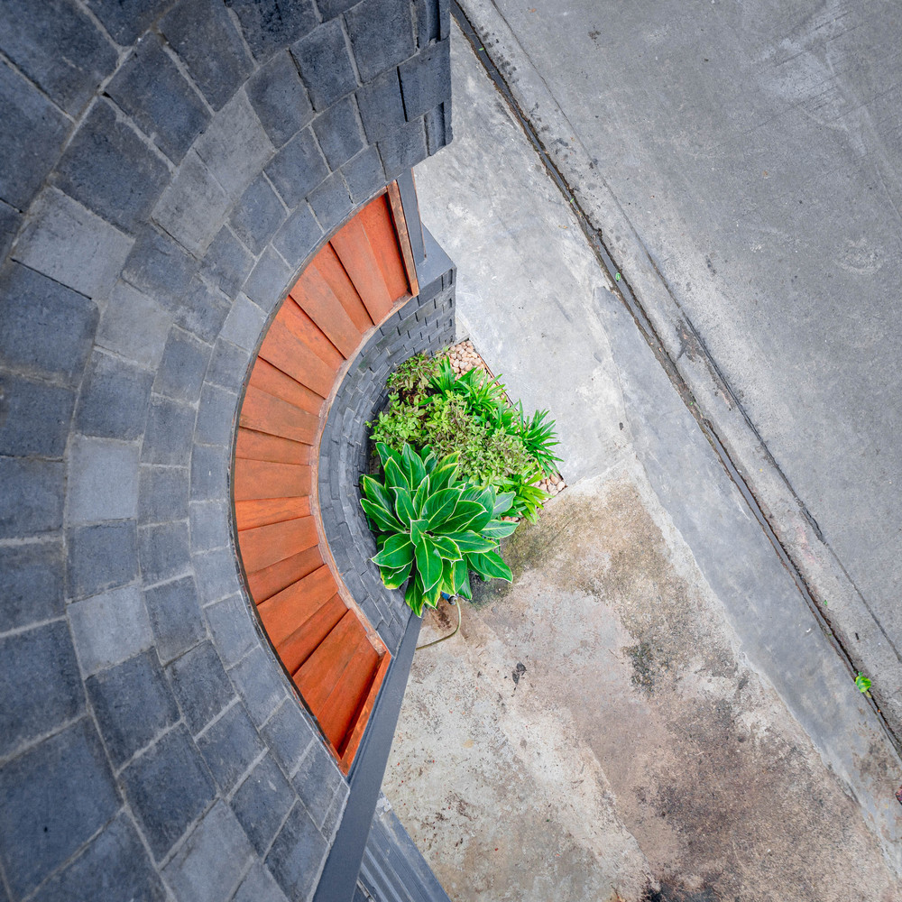
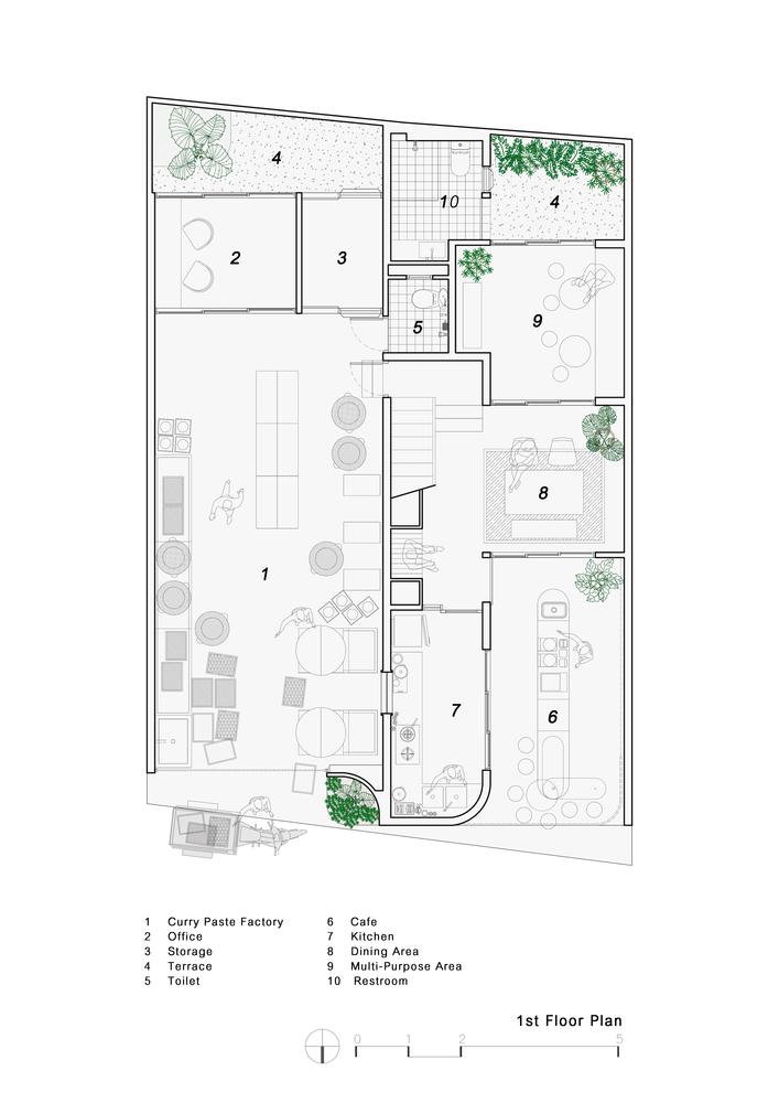
The designer draws an interesting image of the curry paste process as the backbone of the design because it’s something that tells the story of the family well and also has an interesting dimension. The designer interprets this space as a replacement for the home-style chili-making equipment, drawing the appearance of mortar and curry paste to interpret it as architecture by separating the factory and the house with the tone of materials. We used the color tone of curry paste for the factory and gray tone from mortar, brick, and wood from the old building. In addition to clearly separating the working and house space, the color of the curry paste in the factory also helps to blend the stain caused by the manufacturing process.
.
.
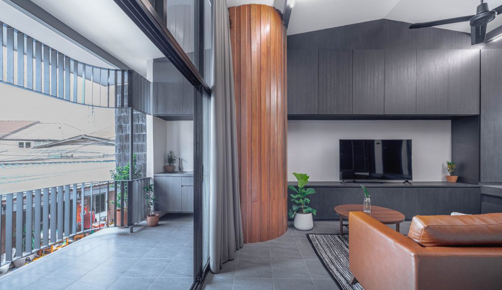
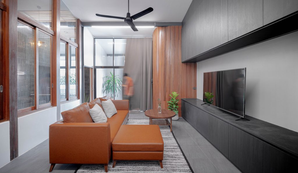
The facade still maintains the identity of the front porch on the second floor of this community. In the past, the balcony was the area that linked each home. The living room is placed next to the balcony to let the air and natural light access easily
.
.
.
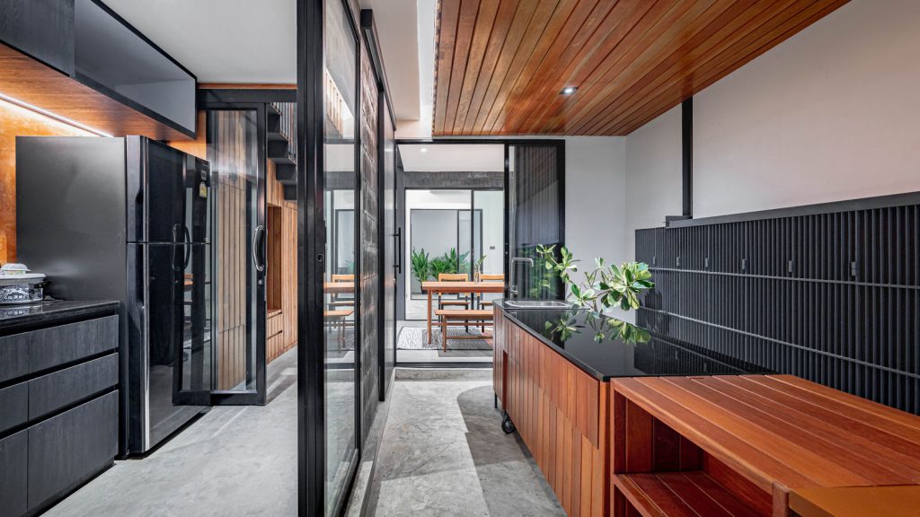
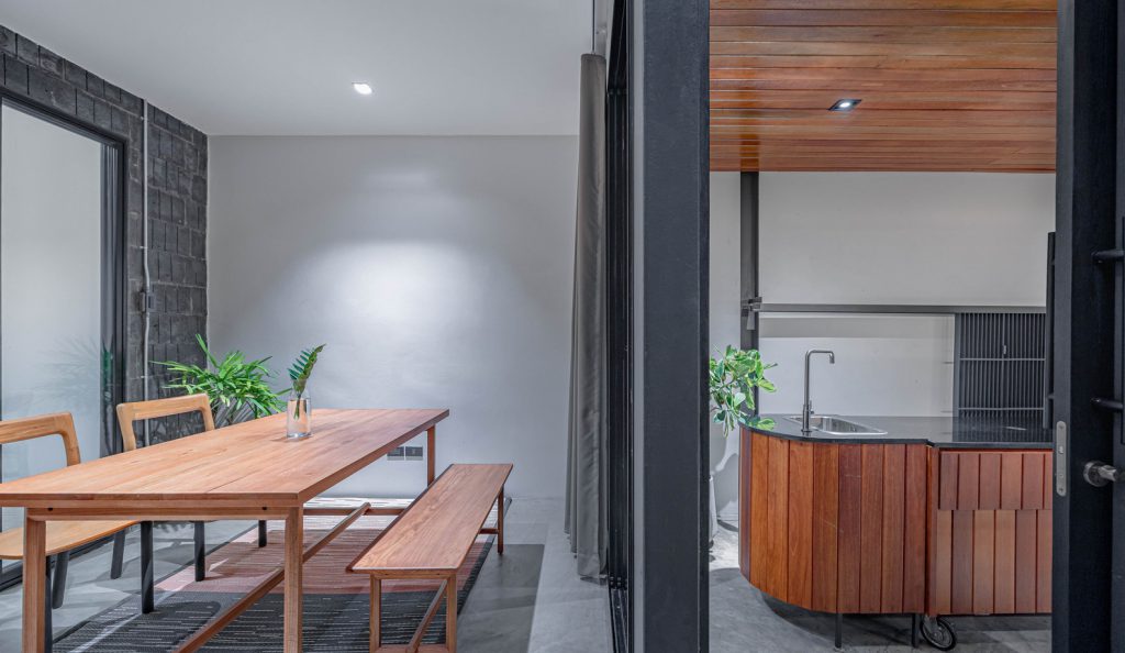
Limitations were put as the main factor in design planning. Including the constraints of surround view and ventilation. The designer brought these limitations to break the familiarity of home-made design, function in front of the house as a welcome zone, and place a Thai kitchen behind the house. On the other hand, this building uses the Thai kitchen to welcome guests at the front of the house and place the dining zone in the next section.
.
.
Because of the road in front of the house is the best airflow area. In the future may add more food business from homemade curry products since the owner’s mom likes cooking. The Thai kitchen is the backbone of the house, connecting the area of the house and curry paste factory. It also helps to support the cafe’s coffee bar, another family business that will occur in the future.
.
.
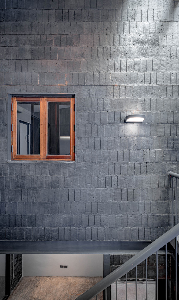
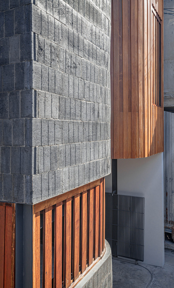
The exterior of the architecture has an outstanding look with the lines for a smooth feeling. But at the same time, it also feels friendly with the surrounding by choosing to use the simple materials to be the building’s frame which is produced in Saraburi. The combination if color schemes were created by various materials, blends well with this street and retains the shape, taste, smell, and sound of the pounding with architecture.
.
.
.
.
.
.
.
.
.
.
.
.
.
.
.
.
.
.
.
.
.
.
.
.
.
.
.
.
.
Cr. Archdaily

