Architects: Manore Architecture
Area : 400 m²
Also : 2020
Photographs : Maira Acayaba
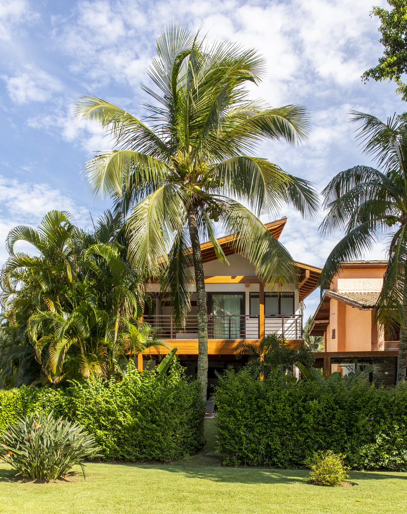
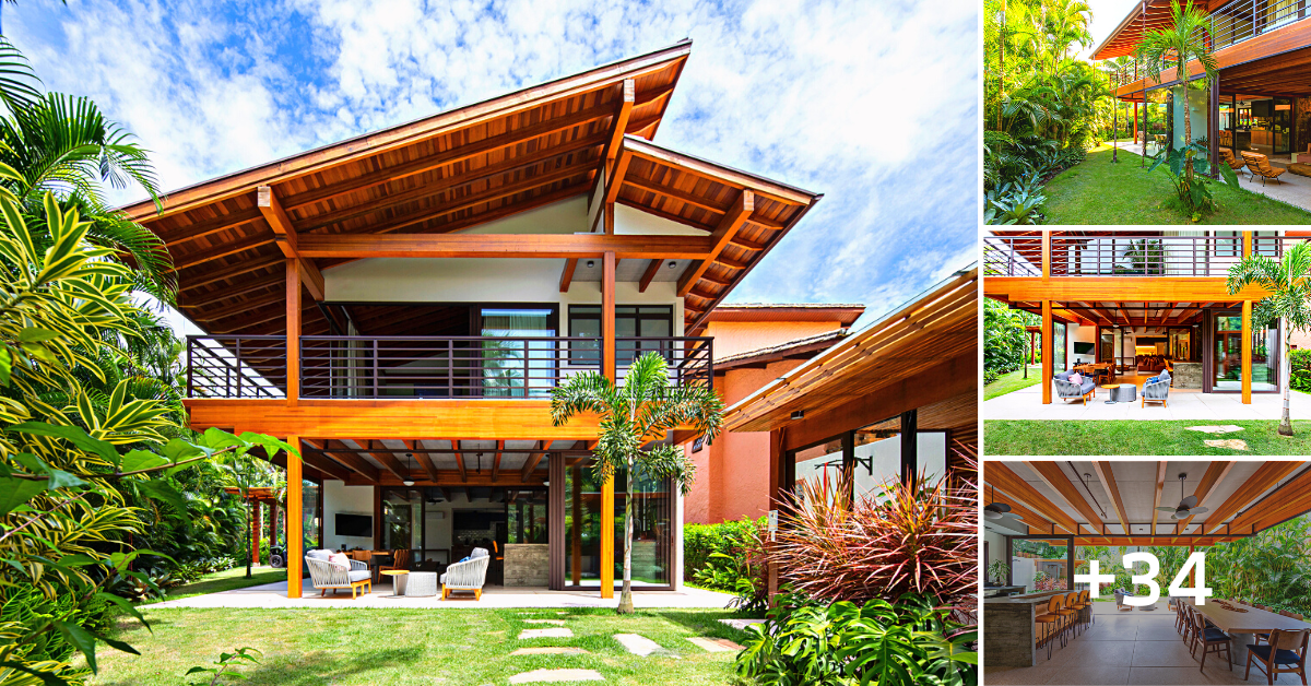
A young couple projects the growth of their family, also aligning their plans for the future. The beach house became more than just a weekend house, but the intention of being a second home for them to experience a richer quality of life and closer to nature.
In this way, the house that should welcome the family under construction, already with 2 small children, was designed for all ages and times. It is timeless and democratic.
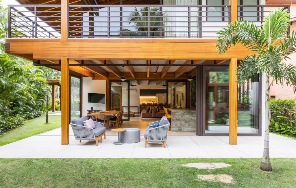
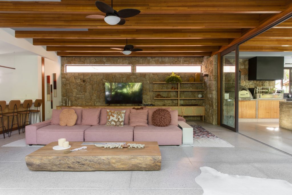
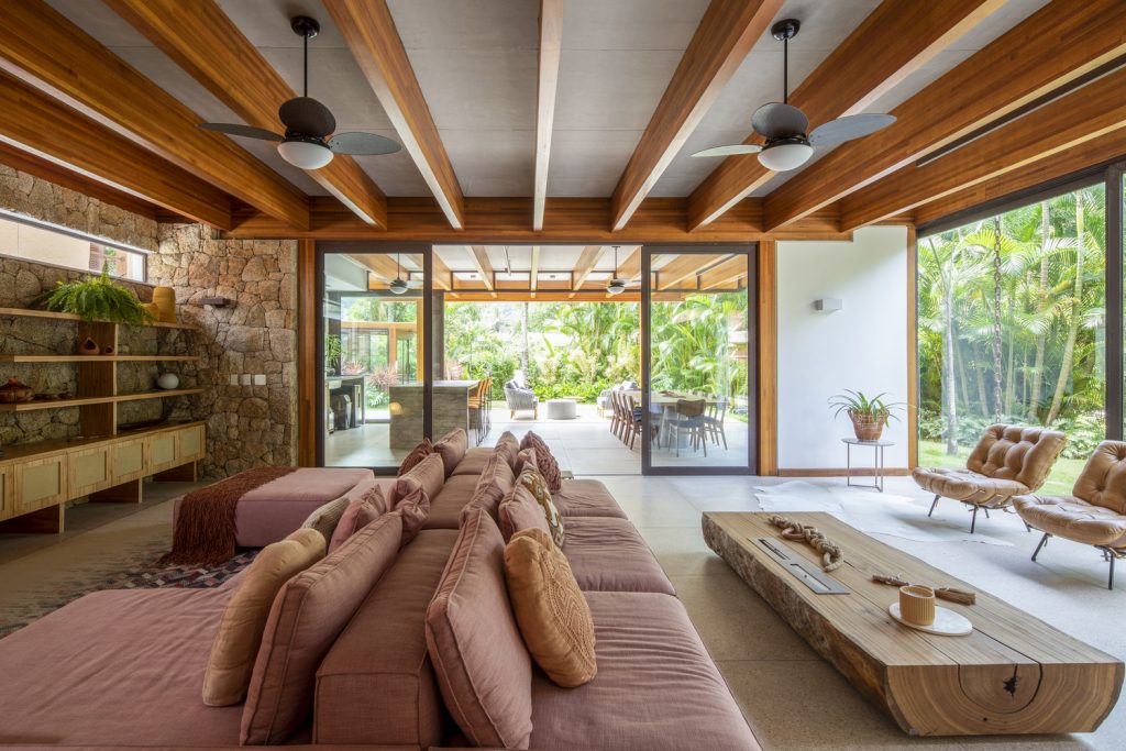
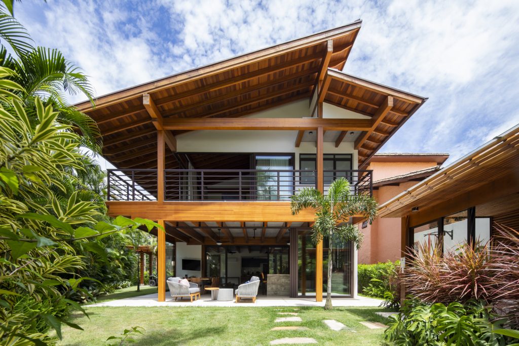
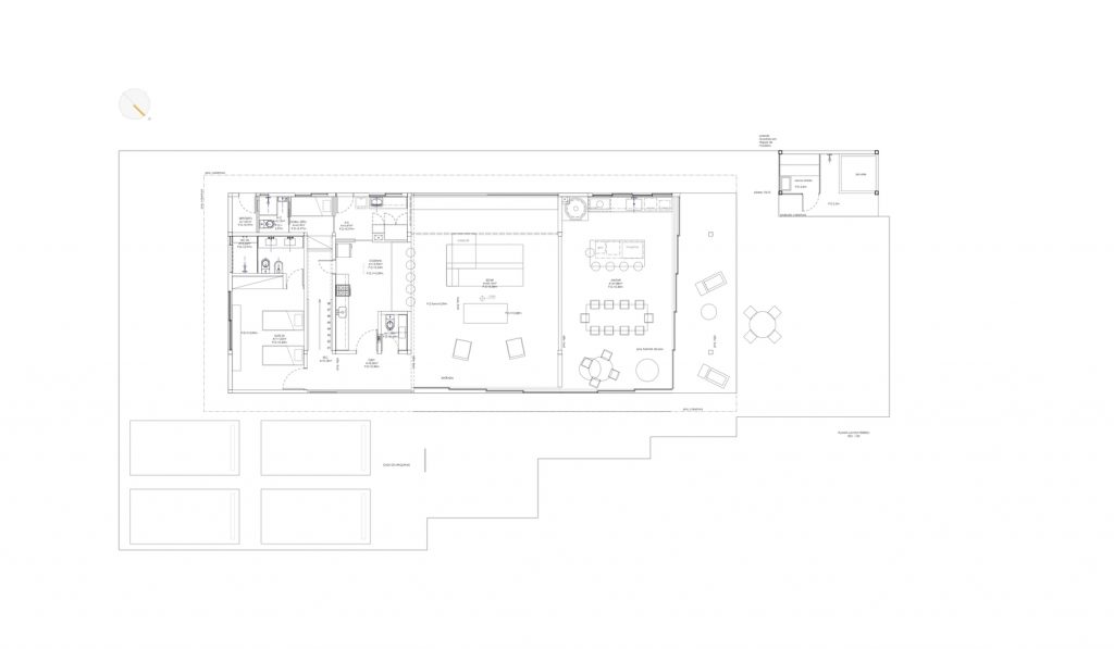
As well as the primordial raw material chosen for its structure, wood. The house was distributed in an elongated floor plan with an easy and integrated ground floor.
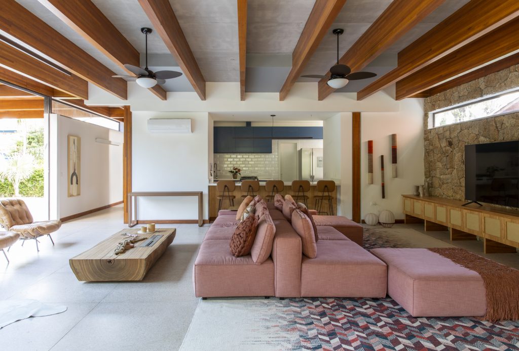
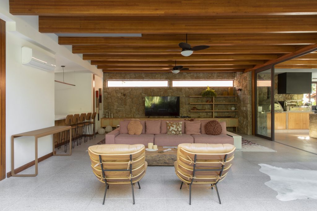
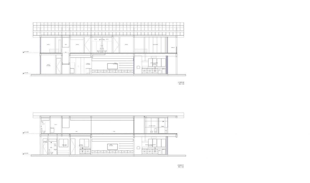
The main kitchen connects with the living room, while providing privacy for everyday meals. The main room may or may not connect to the gourmet area next door.
The sliding door making this interface offers this flexibility in addition to guaranteeing reception on cold days.
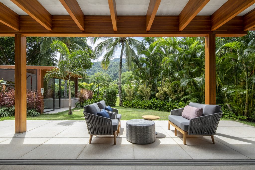
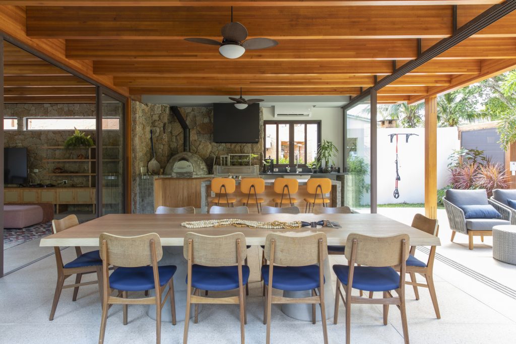
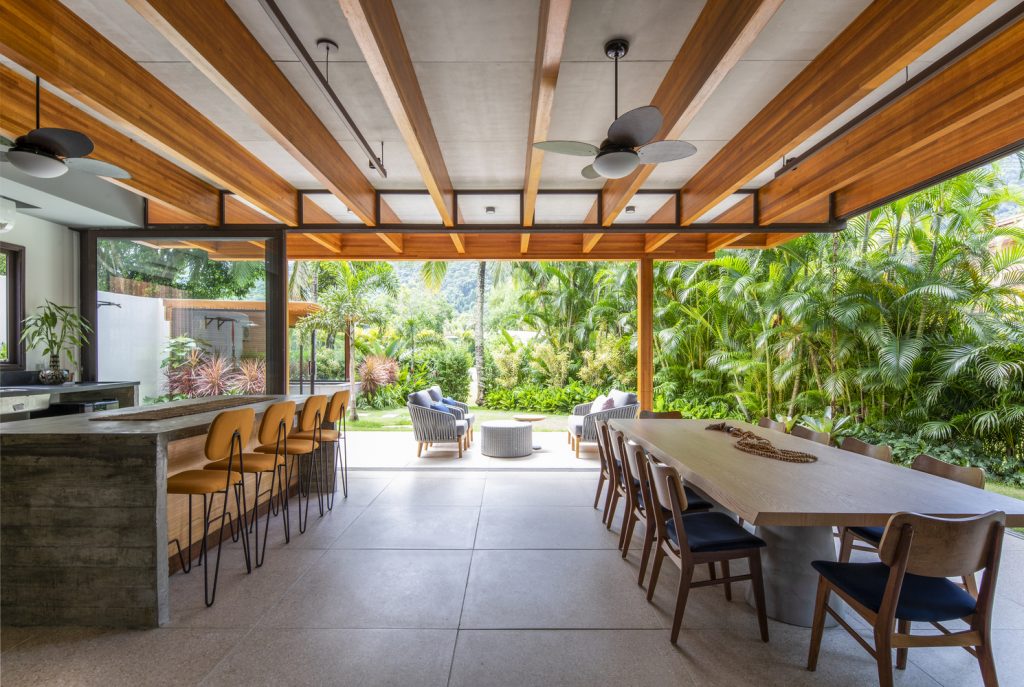
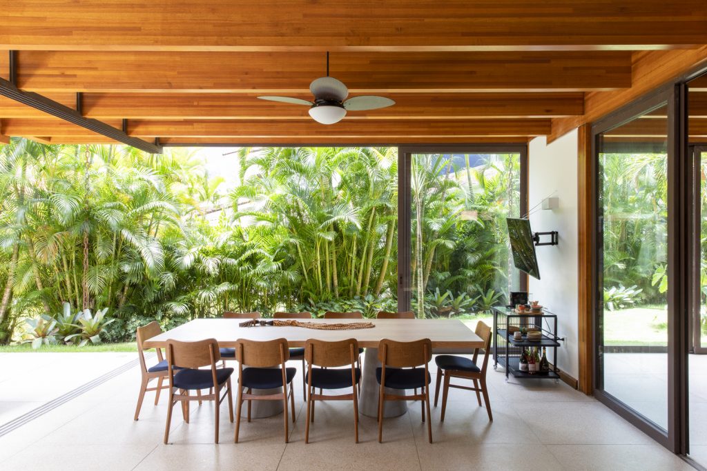
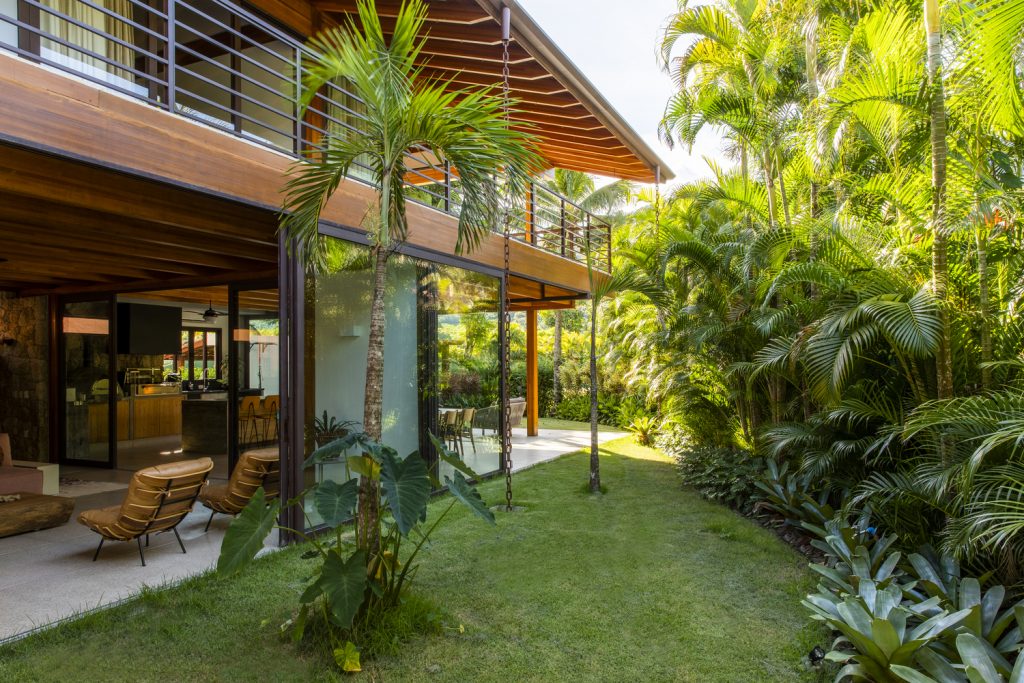
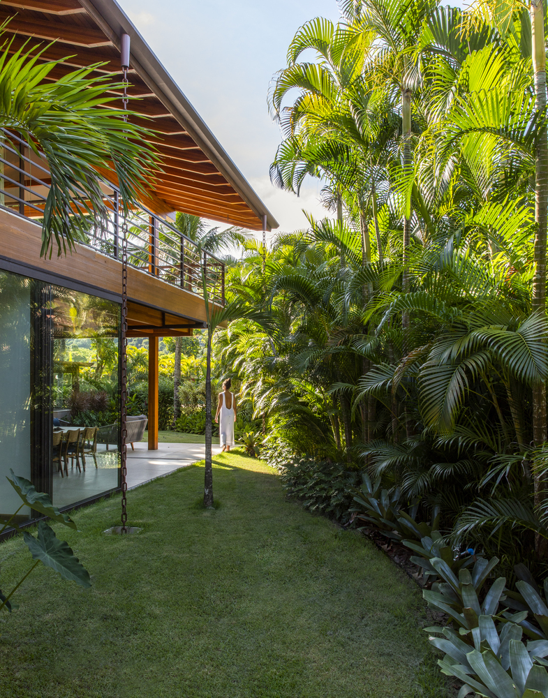
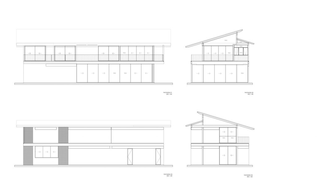
In the gourmet area, the frames level with the external area allow total opening for integration with the external area, allowing this breath and connection with nature.
That’s where a lot of things happen, always around the island of reinforced concrete and the wooden table at Estudio Bola.
The mustard stools, designed by designer Alessandra Delgado, remind us of summer and bring joy to the environment, in addition to marrying very well with the navy blue Maria chairs, by Fernando Jaeger design.
The interesting but challenging thing about the ground floor is that we didn’t have the “background” of the house, where service areas are usually concentrated.
It is a house with 2 fronts, the front facing Rua do condominium and the front facing the large communal swimming pool of the condominium. But that was not a problem for us.
With a demand for a bedroom on the ground floor to support those who do not use the stairs, we inserted this room on the facade in front of the access street to the condominium, in this way it was possible to have a pleasant facade with large windows.
The internal kitchen takes place after this room, with connection and ventilation through the laundry room on its side.
The same, in blue, is part of the project’s art, so we assumed it connecting it with the room.
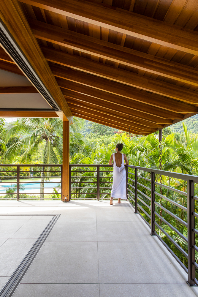
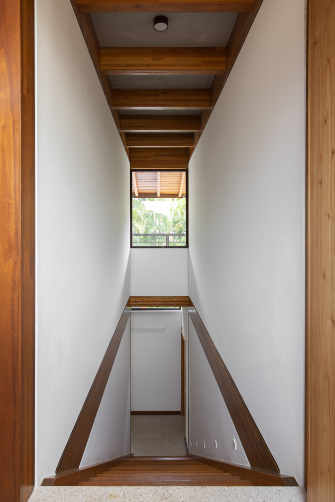
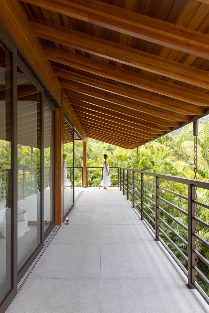
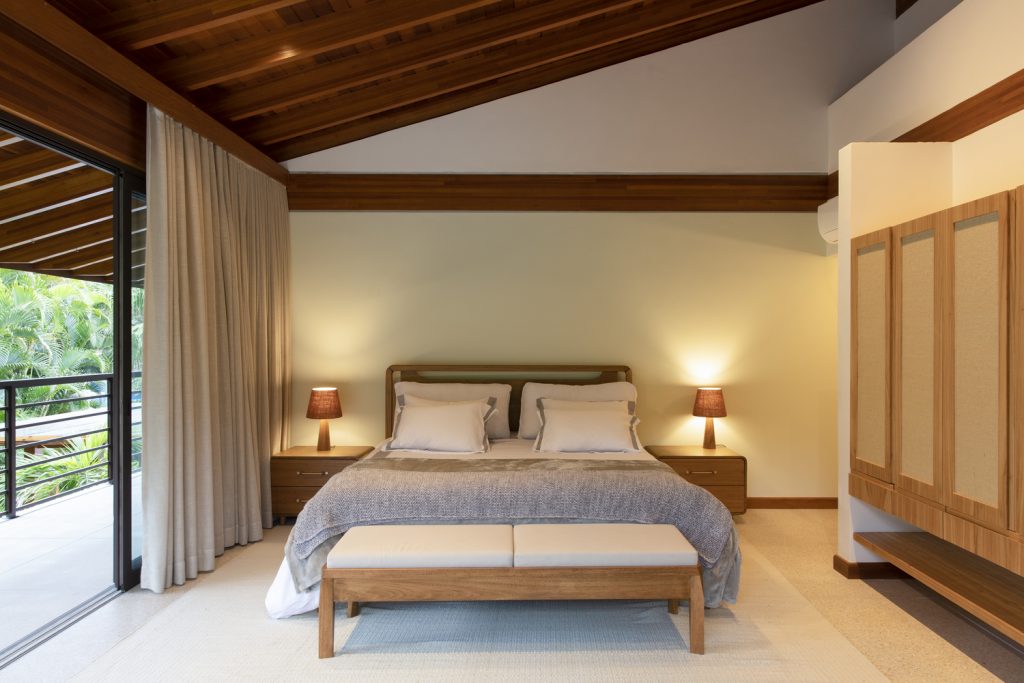
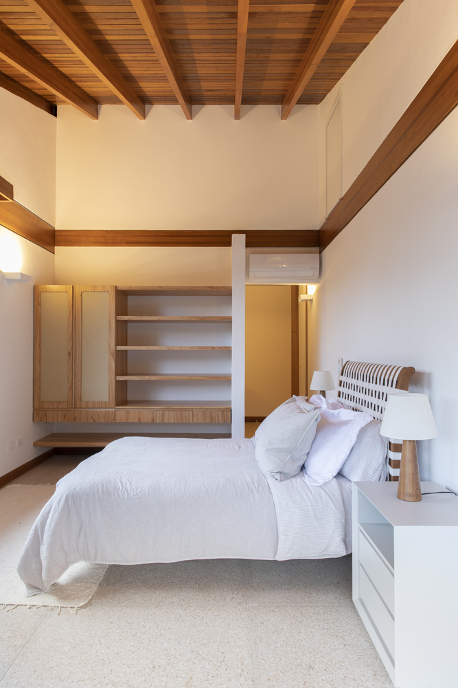
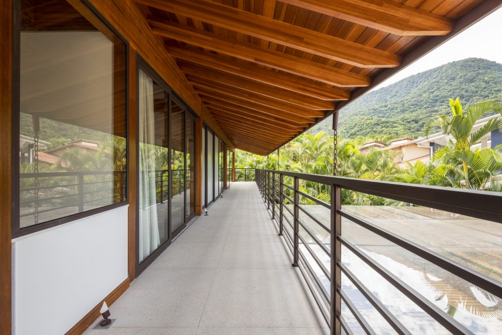
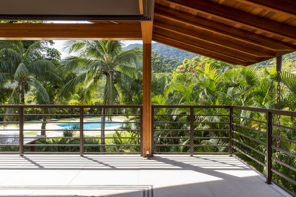
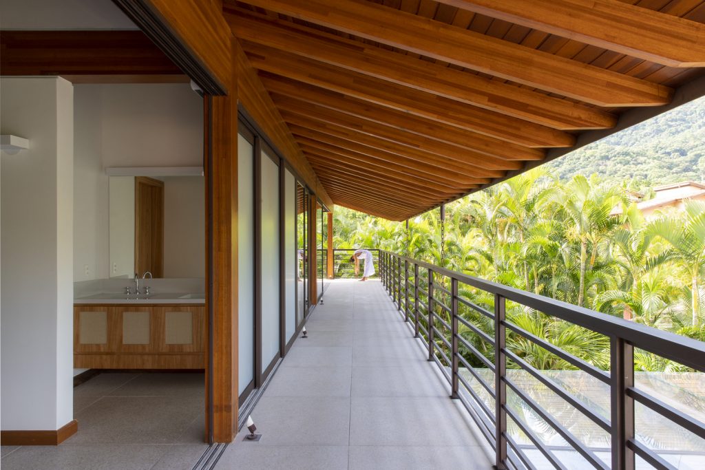
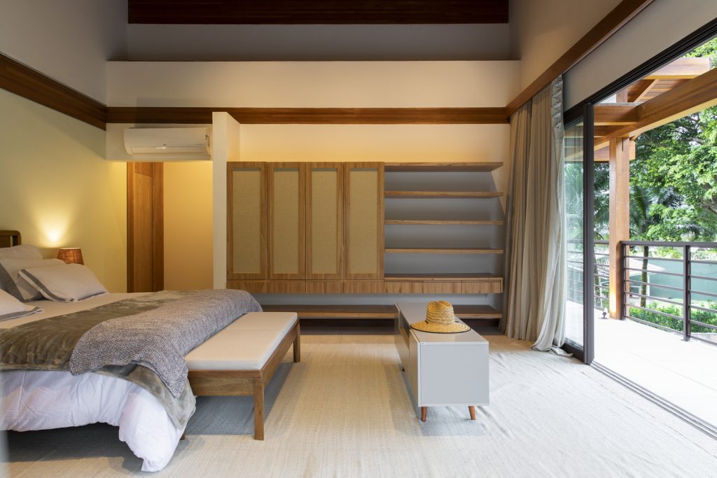
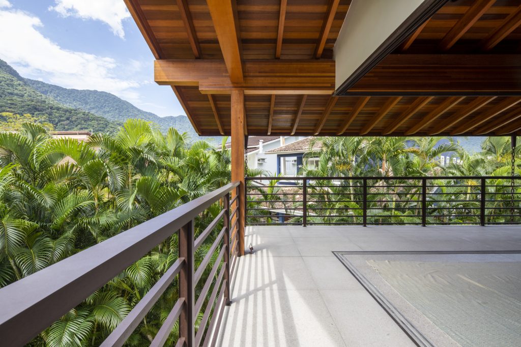
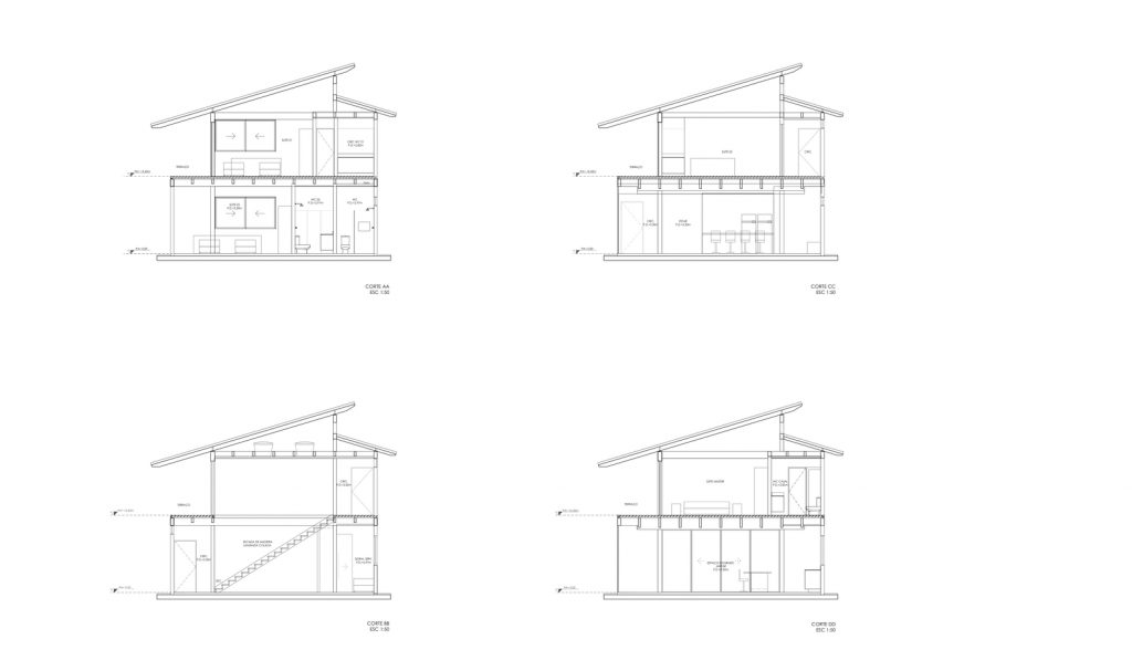
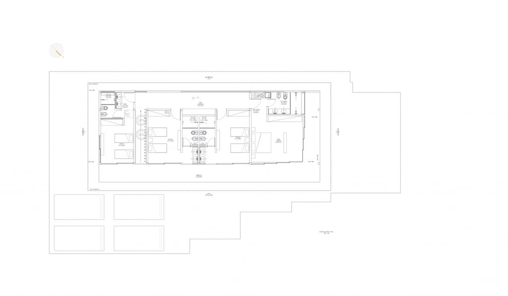
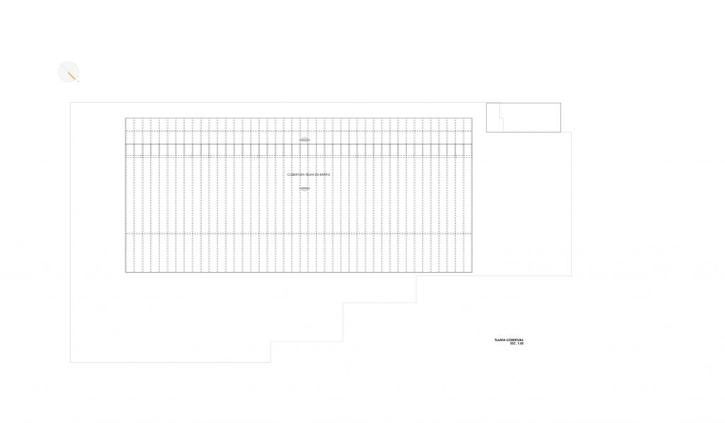
On the upper floor, the rooms are distributed along the floor plan, connected on one side by the corridor with an upper window to allow privacy with neighbors and on the other side, a large terrace integrates the bedrooms and brings the view of the mountains inside.
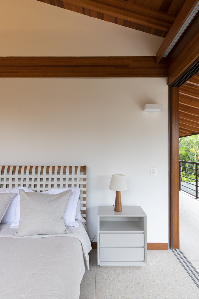
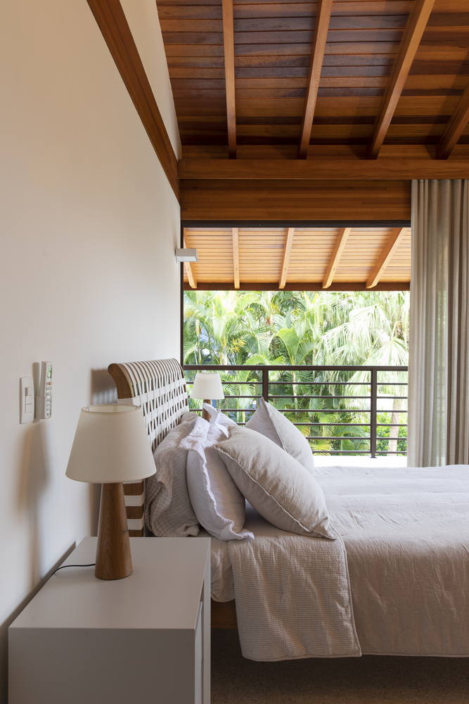
The double bedroom, in front of the pool, is unified with the terrace, made possible by the frames that run completely to the sides.
In the children’s central bathrooms, natural and cross ventilation was revealed naturally, as the mismatch in the heights of the tiles made this benefit possible.
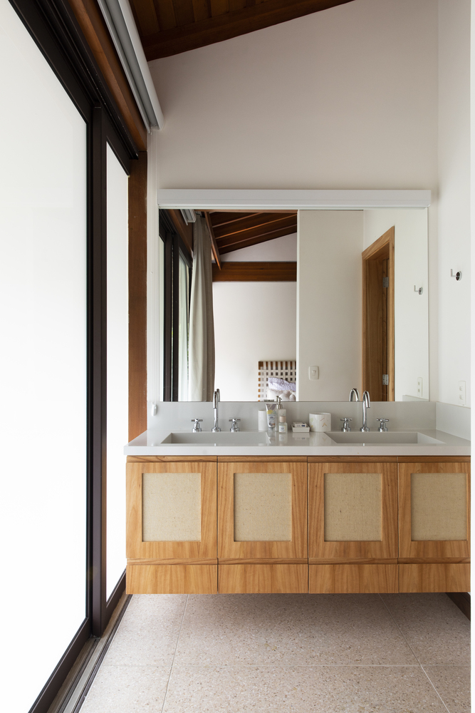
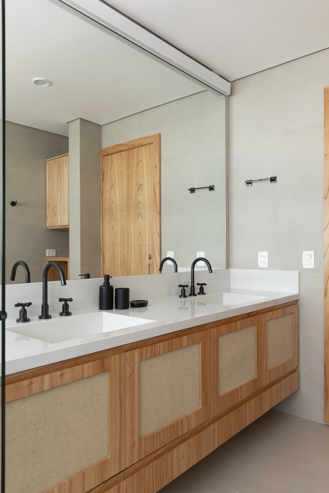
All countertops with sinks and cabinets are outside the bathroom allowing more flexibility for rooms that can accommodate more than 2 people for the experience.
.
.
.
.
.
.
.
.
.
.
.
.
.
.
.
.
.
.
Credit: ArchDaily


